Summarise this article using AI





The web design trends that will define 2027 are pages built for AI readers as well as people, craft that breaks away from AI-made templates, motion handled by the browser instead of heavy JavaScript, oversized type, and accessibility treated as a legal deadline. Most of the louder trends, from custom cursors to WebGL heroes, stay on award sites and rarely reach business websites.
We build and rebuild marketing sites for B2B SaaS companies, so we wanted evidence rather than another mood board. On 15 October 2026 we scanned the homepages of 68 recent Awwwards Sites of the Day and 69 B2B SaaS companies in headless Chrome, pulled 24 months of adoption data for 48 web technologies from HTTP Archive (about 8.7 million sites), checked every CSS feature against its Baseline browser-support status, and read the accessibility laws now in force in the EU, US, UK and India. Each of the 19 trends below comes with a verdict (adopt, test or skip), the number behind it, and who should ignore it.
Key takeaways
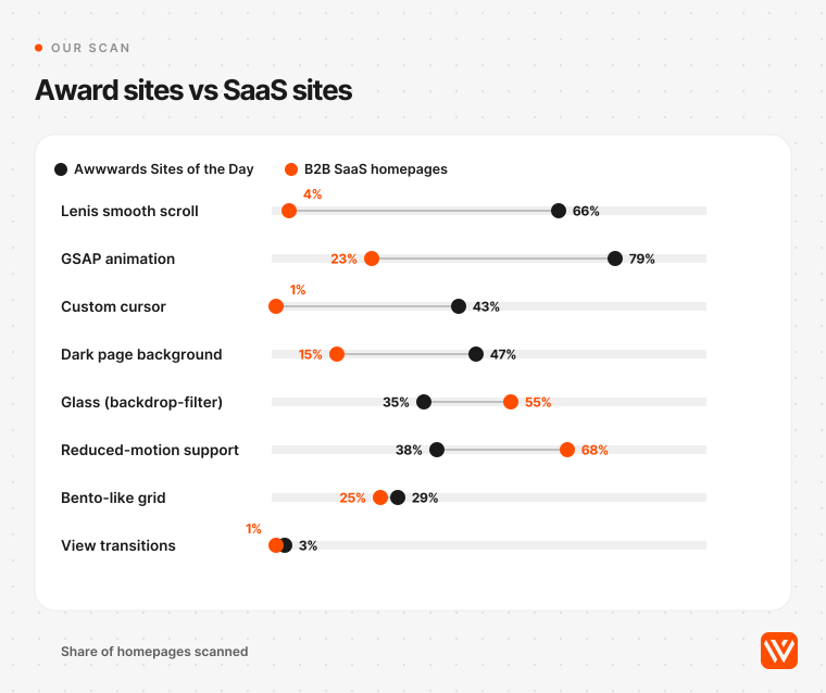
- Smooth scrolling is the fastest-spreading design technology we measured: the Lenis library went from 0.06% to 0.42% of all sites in two years, and it runs on 66% of the award-winning homepages we scanned against 4% of B2B SaaS homepages.
- The most-discussed native browser features barely ship yet. View transitions appeared on 3% of award sites and 1% of SaaS sites; scroll-driven CSS animation on 6% and 10%.
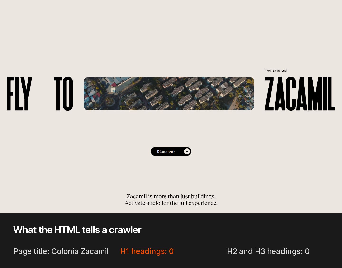
- 21% of award-winning homepages had no H1 at all, against 4% of SaaS homepages. A page an AI agent can't parse is a page it can't recommend.
- Glass effects are more common on SaaS sites (55%) than on award sites (35%). The trend has gone mainstream, and so has its contrast problem.
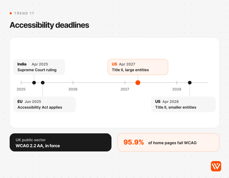
- 95.9% of the top million home pages fail WCAG checks in 2026 (WebAIM), while the EU's accessibility law has applied since June 2025 and the US Title II deadlines land in April 2027 and April 2028.
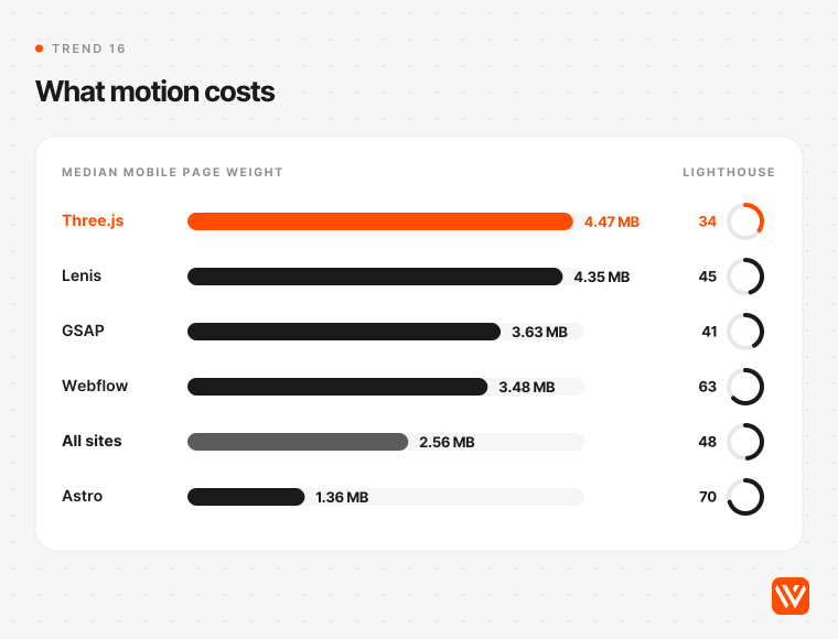
- WebGL hero sections come at a cost. The median mobile page using Three.js weighs 4.47 MB and scores 34 on Lighthouse performance, against 2.56 MB and 48 for all sites (HTTP Archive, September 2026).
How we picked these 19 web design trends
A trend made this list only if it passed two tests: real sites are shipping it (or the browsers just made it possible), and it changes a decision you'll make in a 2027 redesign. Taste alone didn't count.
We used four sources:
- A homepage scan of 137 sites. We rendered the 75 most recent Awwwards Sites of the Day (2 August to 15 October 2026) and 75 randomly drawn B2B companies from Y Combinator's directory with 25 or more staff, at 1440 by 900 pixels in Chrome. 68 award sites and 69 SaaS sites scanned cleanly. For each we recorded 31 signals: libraries, CSS features, dark backgrounds, type size, page weight and more. Our detection matched Awwwards' own technology tags on 39 of 40 GSAP sites and all 16 Webflow sites.
- HTTP Archive's Technology Report, which detects the technology on every home page in its monthly crawl. We pulled September 2024 to September 2026 and measured each technology's share of all sites, because the crawl itself shrank from 9.56 million to 8.74 million origins over the period.
- Baseline browser-support data from webstatus.dev, read on 15 October 2026, for every CSS feature named below.
- Primary sources for the rest: WebAIM, the HTTP Archive Web Almanac 2025, the laws themselves, Google, Apple, Cloudflare, W3C and the people quoted by name.
Two caveats. Around 68 sites per group means differences under about 15 percentage points aren't meaningful, and the SaaS sample skews toward funded US startups. We say so where it matters.
What changed since the 2026 edition
Our 2026 list carried 19 trends too. A year on, about half held up, a few became basic expectations, and some faded. Here's the scorecard.
| 2026 trend | Status for 2027 | What happened |
|---|---|---|
| Dynamic 3D and motion | Split | Motion grew; 3D stalled. Three.js share rose only 4.6% in the last 12 months (HTTP Archive) |
| Full-page interactive headers | Kept, narrower | Hero video sits on 37% of award and 30% of SaaS homepages in our scan |
| Neo-minimalism and white space | Kept | Now "warm whites and one loud accent" (trend 13) |
| Asymmetrical, broken grids | Kept | Part of the anti-template look (trend 2) |
| AI hyper-personalisation | Test | Renamed generative UI; still mostly in products, not marketing sites (trend 3) |
| Sustainable web design | Kept, reframed | Folded into page weight; the median mobile page is still growing (trend 18) |
| Voice-activated navigation | Dropped | No adoption evidence on business websites |
| Retro futurism | Fading | Named by 5 of 10 top 2026 trend pages, 1 of 7 for 2027 |
| Advanced microinteractions | Kept | With an off switch (trend 15) |
| Data-driven storytelling | Merged | Part of type-led and scroll-driven layouts |
| Bold, saturated colour | Reworked | One accent on calm grounds (trend 13) |
| Immersive AR | Dropped | No adoption evidence on marketing sites |
| Kinetic typography | Kept | Type is the hero (trend 9) |
| Collaborative multi-user UX | Dropped | A product pattern, not a website trend |
| Brutalism | Fading | Common in 2026 lists, rare in 2027 ones |
| Mobile-first design | Now the floor | Rewritten as design for every market (trend 19) |
| Smart content loading | Kept | Speculation Rules and image-led LCP fixes (trend 18) |
| Dark mode | Reworked | A choice for the visitor, not a costume (trend 14) |
| Bento grid | Kept, mainstream | No longer sets a site apart (trend 11) |
Part 1: the web has a second reader
Google's AI Overviews reach more than 2 billion people a month, and AI Mode passed 100 million monthly users in the US and India by July 2025, according to Alphabet's Q2 2025 earnings remarks. ChatGPT Atlas and Perplexity Comet now browse sites on a user's behalf. The first three trends follow from that.
1. Pages built for two readers: people and AI agents
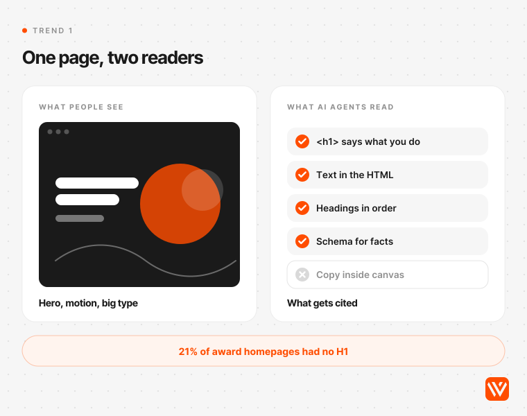
Verdict: adopt. A 2027 page has to work for a person scanning it and for a machine that reads the HTML, decides what the page is about, and may act on it.
The machine side is growing fast. Cloudflare's 2025 Year in Review found crawling by AI agents acting for a user grew more than 15 times during 2025. Microsoft's NLWeb, launched in May 2025, turns a site into a Model Context Protocol server that agents can query. Webflow's chief product officer, Ben Haefele, told CMSWire in September 2026 that enterprise use of agent workflows through MCP went from "close to 2%" at the start of the year to "over 50%".
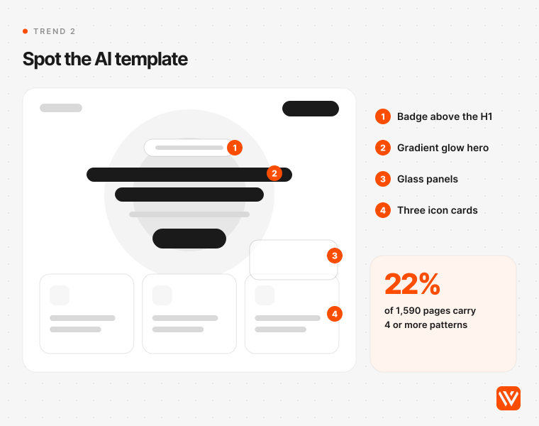
Our scan shows where design gets in the way. 21% of award-winning homepages had no H1, against 4% of SaaS homepages. The median largest H1 on award sites was 37 pixels, against 64 on SaaS sites, because the big display type sits in canvas elements, images or unlabelled divs. That reads beautifully to a person and says almost nothing to a crawler.
What changes on the page:
- One H1 that states what the company does, in real text, plus headings in order.
- Key content present in the server-rendered HTML, readable without clicks, hovers or scroll animations.
- Facts written as plain sentences an engine can quote: prices, limits, who it's for.
- Schema for the organisation, articles and FAQs.
Skip the shortcuts. Google's John Mueller said in April 2025 that no AI service had said it uses llms.txt and compared the file to "the keywords meta tag". It costs little to add one, but it won't fix a page an agent can't read.
This is the work we do most. For Propel, a client of ours, 132 pages are now cited by AI engines. Our guide to answer engine optimisation on Webflow covers the build steps.
2. The anti-template look: craft against AI sameness
Verdict: adopt. As AI tools generate layouts in seconds, a site that looks generated loses trust. All five AI engines we asked (ChatGPT, Perplexity, Gemini, Google AI Overview and Copilot) named a hand-made, anti-template look as a 2027 trend.
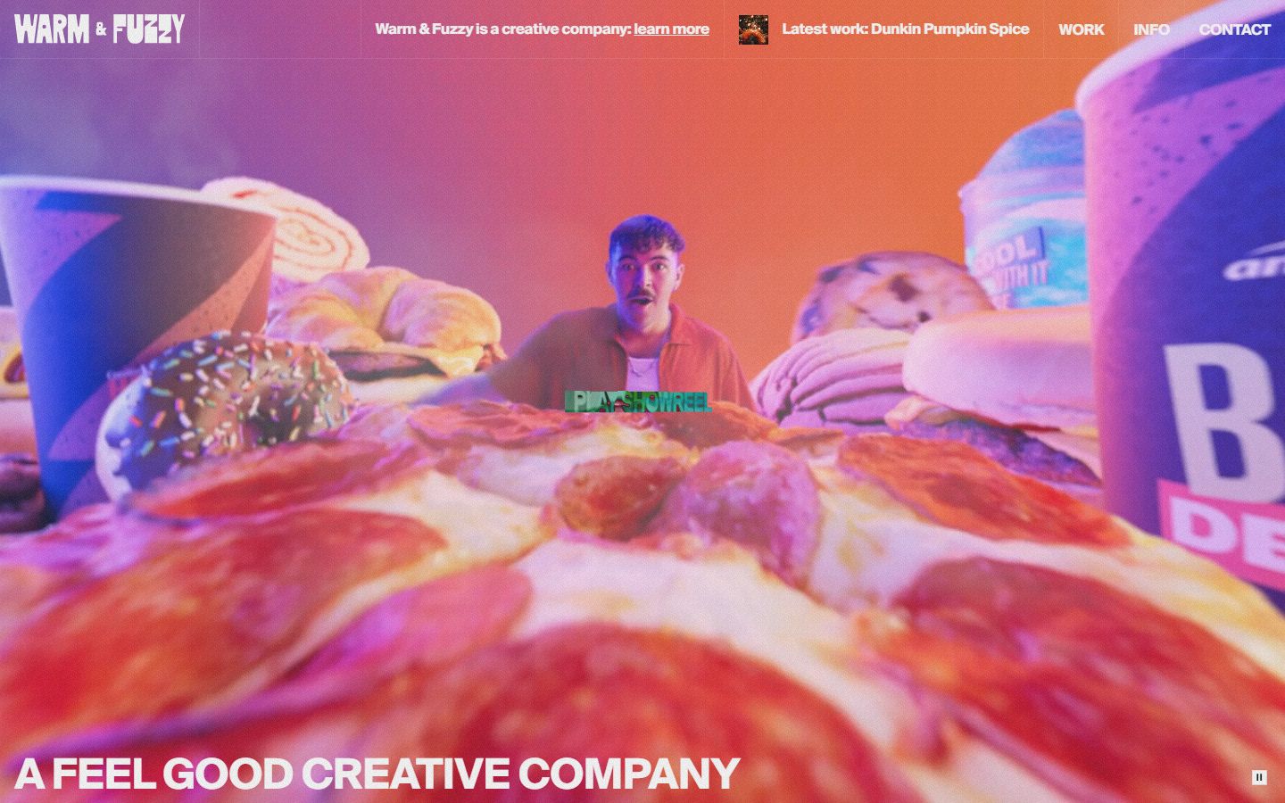
The sameness is measurable. Developer Adrian Krebs scored 1,590 Show HN landing pages in April 2026 against 16 common AI design patterns, including the Inter hero, a purple gradient, a badge above the H1, icon-topped feature cards and glass panels. 22% carried four or more. The toolkits behind that look are spreading fast: shadcn/ui went from 0.13% to 1.32% of all sites in two years, and Tailwind CSS from 2.2% to 7.9% (HTTP Archive, September 2026).
The tools aren't the problem. Defaults are. Figma CEO Dylan Field put it this way at Config 2026: "while AI has lowered the floor, it has not raised the ceiling. Designers, creatives, builders: You will raise the ceiling."
What the anti-template look means in practice: a type choice nobody else in your category uses, photography of your own product and people, layouts that follow your content instead of a feature-card grid, and one or two signature details a visitor will remember. Skip it if you're validating an idea in a week. Then speed beats craft.
3. Adaptive and generative interfaces
Verdict: test in products, skip on marketing sites for now. Generative UI means the interface is assembled for each visitor, instead of one fixed layout for everyone.
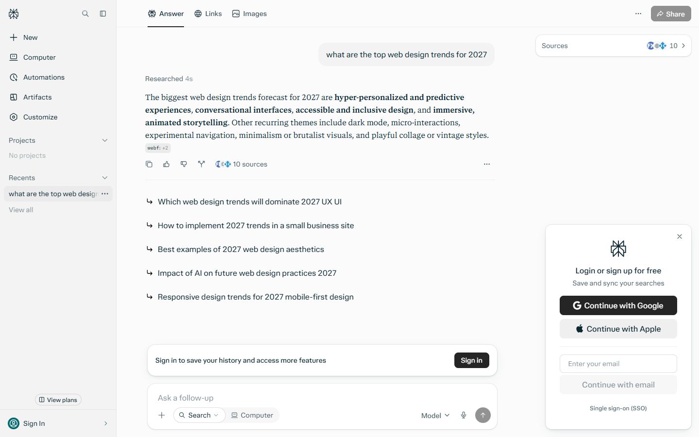
Jakob Nielsen argued in January 2026 that "the concept of a static interface where every user sees the same menu options, buttons, and layout... is becoming obsolete", and called 2026 the year the shift to generative UI starts. Google's AI Overview for "web design trends 2027" leads with the same idea.
The evidence on marketing sites is thin. We found no public study showing generative layouts convert better on a B2B website. Google's own Material research found that when designs broke familiar patterns, "usability scores suffered". Personalise the content (case studies by industry, pricing by region) before you personalise the layout. When we asked Perplexity which trends are overhyped, floating AI chat widgets made its list.
Part 2: the browser now handles motion
Two years ago, smooth page transitions and scroll effects needed JavaScript libraries. Browsers now do much of it natively, and the old scroll libraries are in decline. Interop 2025, the joint browser-compatibility effort, took the combined cross-browser score from 25 to 95, and Interop 2026 targets 20 focus areas, including cross-document view transitions and scroll-driven animations (Mozilla, February 2026).
4. Smooth scroll goes mainstream

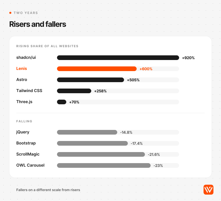
Verdict: test. Lenis, a small smooth-scrolling library, is the fastest-growing design technology in our data. Its share of all sites rose from 0.06% to 0.42% between September 2024 and September 2026, from 5,721 to 36,643 sites. It runs on 66% of the award-winning homepages we scanned and 4% of SaaS homepages.
It's the signature feel of the 2026 award site: scroll that eases and glides. It's also where B2B sites should be careful. Lenis sites have a median mobile page weight of 4.35 MB against 2.56 MB for all sites, partly because of what tends to ship with it (video, WebGL, GSAP) rather than the small library itself. And award sites honour the visitor's reduced-motion setting far less often than SaaS sites (38% against 68%).
If you add smooth scroll, keep native scrolling for anyone who asks for reduced motion, never hijack the scroll position, and test on a mid-range Android phone. The older approach is fading: ScrollMagic lost 21.6% of its share in two years and scrollreveal 25.9%.
5. Page transitions without JavaScript
Verdict: adopt as an enhancement. View transitions animate the change from one page to the next, so a multi-page site can feel like an app.
Same-document view transitions became Baseline (supported in all major browsers) on 14 October 2025. The cross-document version, the one that matters for normal websites, works in Chrome and Edge from version 126 and Safari from 18.2, with no Firefox support yet, and it's an Interop 2026 focus area. Browsers without support simply load the next page as usual, so there's little risk in adding it.
Almost nobody has. View transitions appeared on 3% of award homepages and 1% of SaaS homepages in our scan. Meanwhile 15% of award sites still use Barba.js, a JavaScript library that fakes page transitions. Expect that to flip within two years. On a Webflow site, cross-document transitions take a few lines of custom CSS.
6. Scroll-driven animation in CSS
Verdict: test. CSS can now tie an animation to the scroll position: a progress bar, an image that scales as it enters, a heading that slides in. Mozilla's Interop 2026 announcement describes it as replacing "heavy JavaScript solutions that run on the main thread".
Support is still limited: Chrome since version 115 and Safari since 26 (September 2025), with no Firefox. Our scan found it on 6% of award sites and 10% of SaaS sites. Use it for decoration that can safely be missing, and keep content visible without it.
7. Components that respond to their container
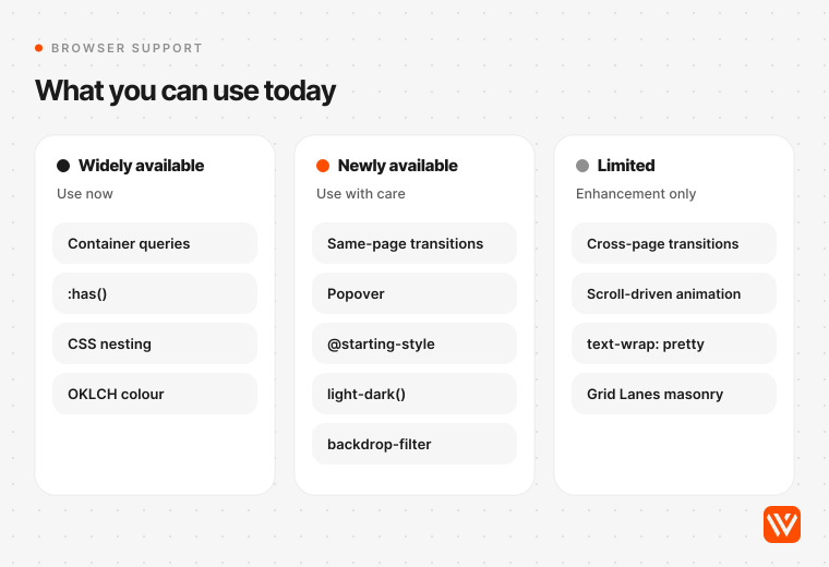
Verdict: adopt. Container queries let a card or pricing block change its layout based on the space it has, not the screen width. The :has() selector lets a parent style itself based on what it contains. Together they make design systems behave.
Both are now "widely available" on Baseline: container queries since 14 August 2025 and :has() since 19 June 2026. Container style queries reached "newly available" on 19 May 2026. Our scan found :has() on 53% of award sites and 54% of SaaS sites, and container queries on about a fifth of each. This is the least visible trend on the list and the one with the best return for anyone maintaining a component library.
8. Native menus, popovers and selects
Verdict: adopt the popover, test the rest. The browser now ships primitives that used to need a UI library: the Popover API (Baseline since January 2025), @starting-style for entry animations (Baseline since August 2024), anchor positioning (shipped in Safari 26 in September 2025 and an Interop 2026 focus area) and a fully stylable <select> (Chrome 135 and Safari 27 so far).
Google's Rachel Andrew wrote that bringing anchor positioning to Baseline means interfaces can be built "without having to rely on third-party libraries". The adoption data points the same way. Between 2024 and 2026, jQuery fell from 74.9% to 63.9% of all sites, Bootstrap lost 17.4% of its share, and the old carousel plugins OWL Carousel and Slick fell 23% and 12.5%.
One caution. Native doesn't automatically mean accessible. Accessibility engineer Sara Soueidan tested Chrome's new CSS carousel features in 2025 and concluded "CSS Carousels are not accessible", at least in that implementation. Test with a keyboard and a screen reader before you remove the library.
Part 3: the visual language of 2027
9. Type is the hero image
Verdict: adopt. Big, confident type does the work a stock hero image used to do. Seven of the ten pages Google cites for "web design trends 2026" named bold or oversized typography, the strongest visual agreement on that results page.
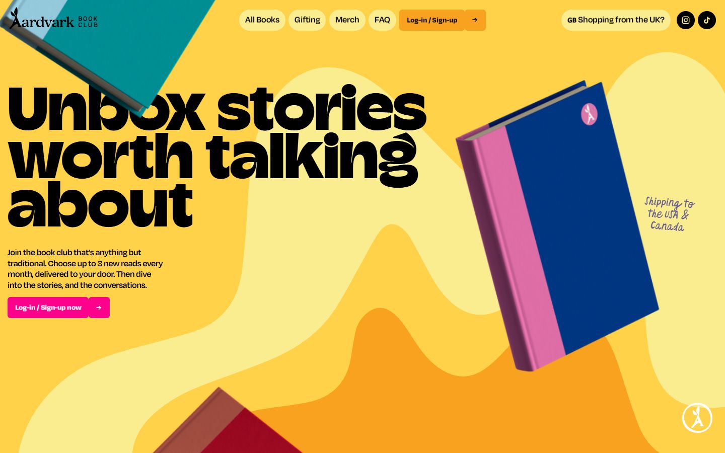
Our scan quantifies it. 41% of award homepages put text of 80 pixels or more on the first screen, against 19% of SaaS homepages. About half of both groups size type fluidly with clamp(), and about a third use variable fonts. Wrapping has improved too: text-wrap: balance and pretty, which stop orphaned last words, appear on 62% of SaaS homepages. WebKit's Jen Simmons said Safari's version of pretty adjusts the whole paragraph so text is "easier to read and softer on the eyes".
Keep the hero headline in a real H1 (see trend 1), check it at 320 pixels wide, and load one or two font files, not six.
10. Glass, with contrast rules
Verdict: test, with a contrast check on every panel. Apple's Liquid Glass, launched on 9 June 2025 as what Apple called "our broadest software design update ever", brought translucent panels back into fashion, and backdrop-filter has been Baseline since September 2024.
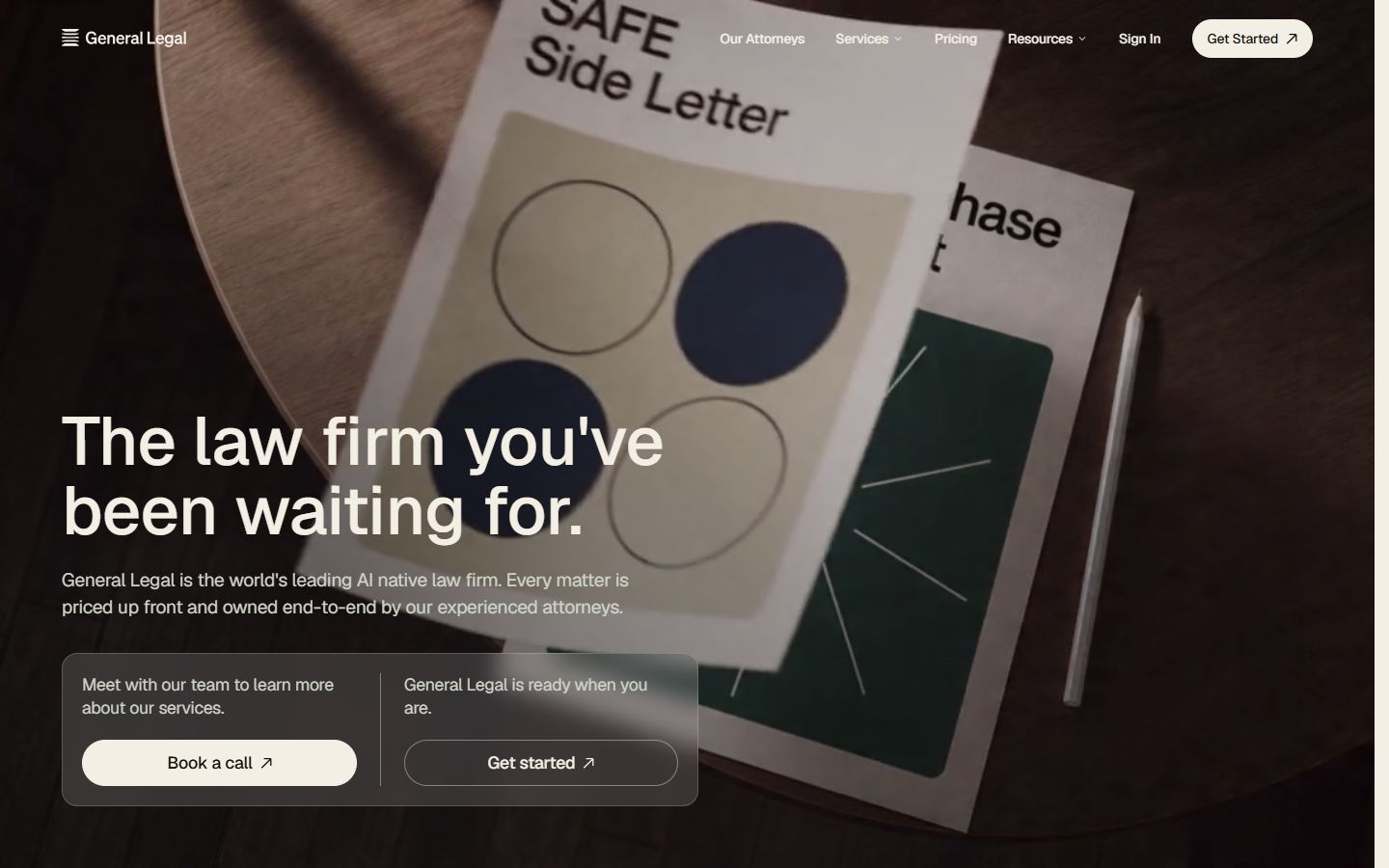
The AI engines disagree on whether glass is back. Our scan settles it: glass is already mainstream, and more so on business sites. 55% of SaaS homepages used backdrop-filter, against 35% of award homepages. Krebs lists glass panels among the giveaways of an AI-made page, so the effect no longer signals craft.
The usability cost is documented. Infinum measured contrast as low as 1.5:1 in Liquid Glass, against the 4.5:1 minimum. Nielsen Norman Group's Raluca Budiu concluded that iOS 26's visual language "obscures content instead of letting it take the spotlight". (The executive who launched Liquid Glass, Alan Dye, left Apple for Meta in December 2025.) Use glass on navigation bars and overlays over predictable backgrounds, never under body text, and test contrast against the busiest part of the image behind it.
11. Bento grids, grown up
Verdict: adopt for feature sections, not as a whole-page template. Bento grids (tiles of different sizes in one view) are now standard. Our scan found bento-like layouts on 29% of award and 25% of SaaS homepages, statistically the same. A pattern everyone uses no longer sets a site apart, and Perplexity's 2027 answer called bento grids "no longer novel".
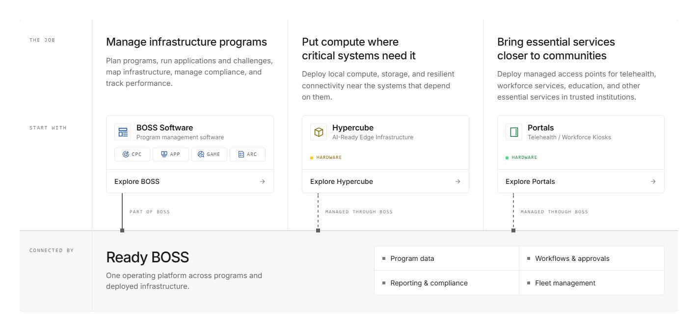
Bento still works for what it's good at: showing six product capabilities at a glance. Where it fails is mobile, where the tiles collapse into one long column of cards. Design the mobile order on purpose. The next step is true masonry: CSS Grid Lanes, settled after long debate in the CSS Working Group and shipped in Safari 26.4 in March 2026. Jen Simmons says you can "start using it as soon as you want with progressive enhancement".
12. Expressive interfaces
Verdict: test. Google's Material 3 Expressive, launched in May 2025, came out of 46 studies with more than 18,000 participants. Google reports that up to 87% of 18-to-24-year-olds preferred the expressive designs and that people spotted key elements up to four times faster.
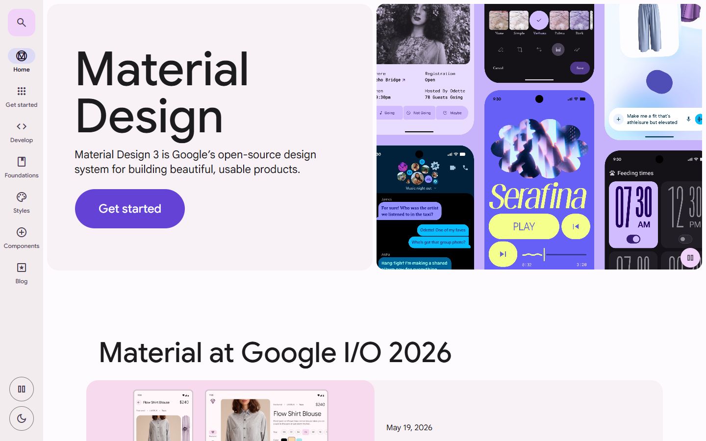
Google's own research team also found the limits. A "strong minority of users preferred calmer, less intense versions", and removing text labels "resulted in decreased usability". Their summary is the right rule for 2027: "No amount of expressive design will beat basic functionality." Use shape, colour and motion to signal what matters, then A/B test it against your current layout.
13. Warm whites and one loud accent
Verdict: adopt. Pantone's 2026 Colour of the Year was a white, Cloud Dancer, which the Pantone Color Institute described as "a conscious statement of simplification". It fits what the better B2B sites already do: soft off-white grounds, near-black text and one saturated brand colour used sparingly.
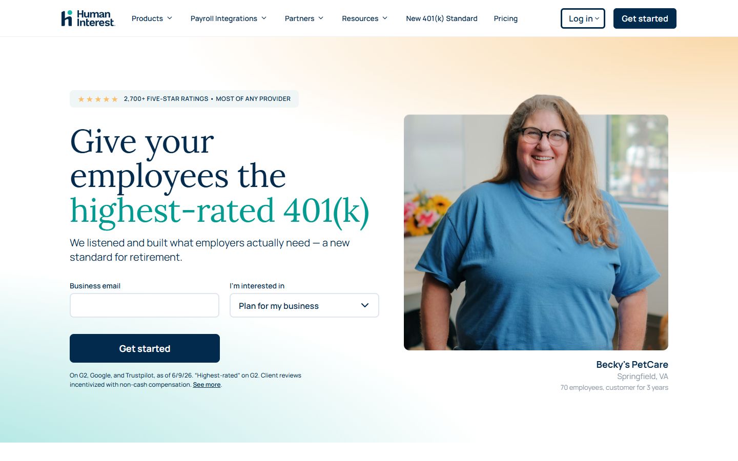
The tooling caught up. OKLCH colour, which keeps perceived brightness even across a palette, became widely available on Baseline in November 2025, and contrast-color(), which picks readable text automatically, reached newly available in April 2026. Contrast is still the most common failure on the web: WebAIM found low-contrast text on 83.9% of home pages in 2026.
14. Dark mode as a choice, not a costume
Verdict: adopt dual themes for product-led sites; skip dark as a default look. Dark is the award-site uniform: 47% of the award homepages we scanned had a dark page background, against 15% of SaaS homepages. But SaaS sites haven't rejected dark. 39% of them open on a dark first screen (41% for award sites), usually a dark hero on a light page.
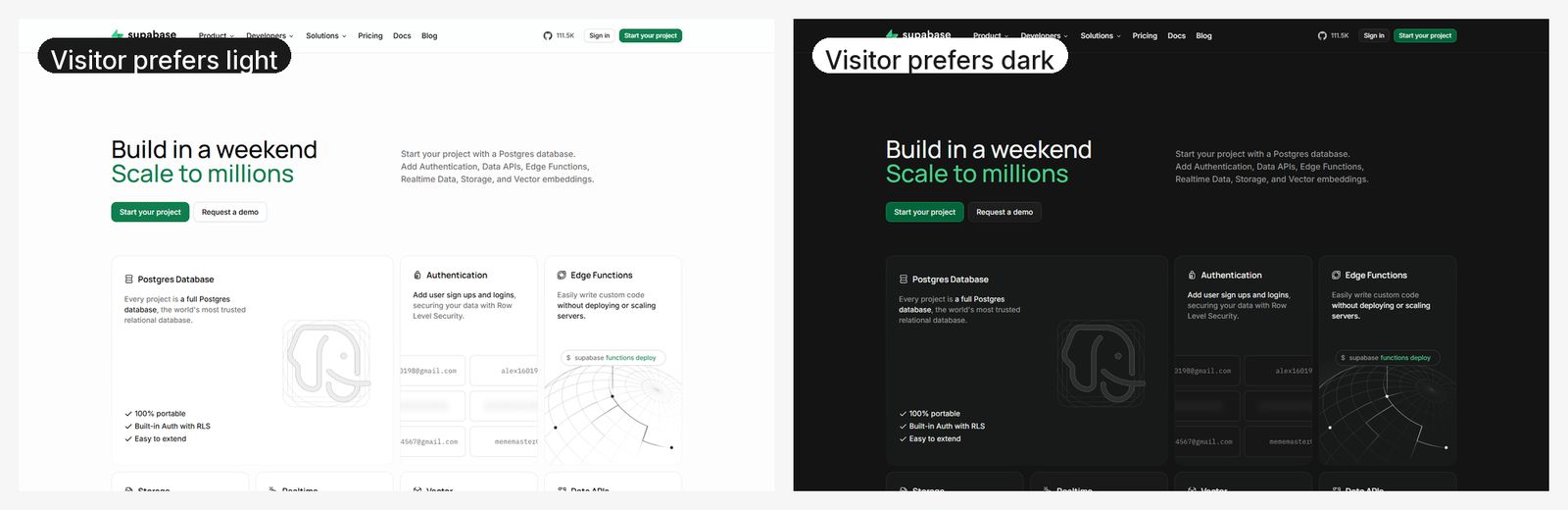

The bigger difference is choice. 20% of SaaS homepages respond to the visitor's dark-mode setting, against 7% of award sites. CSS light-dark() has made dual themes easier since 2024. When we asked Perplexity which trends are overhyped, "dark mode as default aesthetic" made its list. Dark and fast can coexist: the First December Films site we built opens on a dark, cinematic hero and loads its largest element in 1.05 seconds.
15. Motion with a purpose and an off switch
Verdict: adopt purposeful motion; skip custom cursors on business sites. Motion that explains (a state change, a loading step, a product demo) earns its place. Motion for its own sake wears out. As Nielsen Norman Group put it: "delight turns into distraction on the tenth, twentieth, or hundredth time."

Our scan separates the two worlds clearly:
| Pattern | Award homepages | B2B SaaS homepages |
|---|---|---|
| GSAP animation library | 79% | 23% |
| Custom cursor | 43% | 1% |
| Blend-mode "difference" effects | 50% | 6% |
| Respects reduced-motion settings | 38% | 68% |
GSAP's share of all sites is flat at 8.76% over two years (HTTP Archive). The fix costs little: wrap non-essential animation in a prefers-reduced-motion check, keep interactions under the 200-millisecond INP threshold, and never block reading while something animates.
16. 3D where it sells
Verdict: skip as a default for B2B sites; test for product configurators. 57% of award homepages ran a WebGL canvas in the hero, against 10% of SaaS homepages. Three.js, the main 3D library, grew 70% in share over two years, but only 4.6% in the last twelve months. The 3D boom has plateaued.
The cost shows up in HTTP Archive's September 2026 data:
| Sites using | Median mobile page weight | Median Lighthouse performance score |
|---|---|---|
| Three.js | 4.47 MB | 34 |
| Lenis | 4.35 MB | 45 |
| GSAP | 3.63 MB | 41 |
| All sites | 2.56 MB | 48 |
| Webflow | 3.48 MB | 63 |
| Astro | 1.36 MB | 70 |
Tools like Spline and Rive get plenty of design-press attention but appeared on 0 to 4% of homepages in our scan. Use 3D when the object is the product (hardware, a configurator, a spatial demo) and give it a static fallback. A rotating abstract blob above your pricing doesn't sell.
Part 4: obligations that now shape the design
17. Accessibility with a legal deadline
Verdict: adopt, now. Accessibility has moved from good practice to a compliance date in most of the markets B2B sites sell into.
| Market | Rule | Date | Standard |
|---|---|---|---|
| European Union | European Accessibility Act (Directive 2019/882), covers e-commerce and many consumer services; microenterprises providing services are exempt | Applies since 28 June 2025 | Accessibility requirements in the Act |
| United States | ADA Title II web rule for state and local government | 26 April 2027 (50,000+ population), 26 April 2028 (smaller entities), moved by the DOJ on 20 April 2026 | WCAG 2.1 AA |
| United Kingdom | Public sector accessibility regulations; Equality Act 2010 duty for all service providers | In force | WCAG 2.2 AA (public sector) |
| India | Supreme Court, Amar Jain v. Union of India, read digital access into the right to life (Article 21) | 30 April 2025 | Directions to government |
| Japan | JIS X 8341-3:2016, recommended for the public sector | Voluntary | WCAG 2.0-based |
The web is moving the wrong way. WebAIM's 2026 Million report found 95.9% of the top million home pages had automatically detectable WCAG failures, up from 94.8%, with 56.1 errors per page. Pages grew to 1,437 elements on average, up 14.3% in a year, and WebAIM links the decline partly to "AI-assisted coding practices ('vibe coding')".
Overlays aren't the answer: the Web Almanac 2025 found them on about 2% of desktop sites but only 0.2% of the top 1,000. WCAG 3 is still a working draft, and W3C says the best preparation "is to meet WCAG 2.2 success criteria now". Our WCAG 2.2 checklist for Webflow turns that into tasks.
18. Performance and page weight as design constraints
Verdict: adopt. Design choices decide speed. The HTTP Archive Web Almanac 2025 found that only 48% of mobile sites and 56% of desktop sites pass Core Web Vitals. Mobile is weakest on Largest Contentful Paint (62% good), and an image is the largest element on 76% of mobile pages.
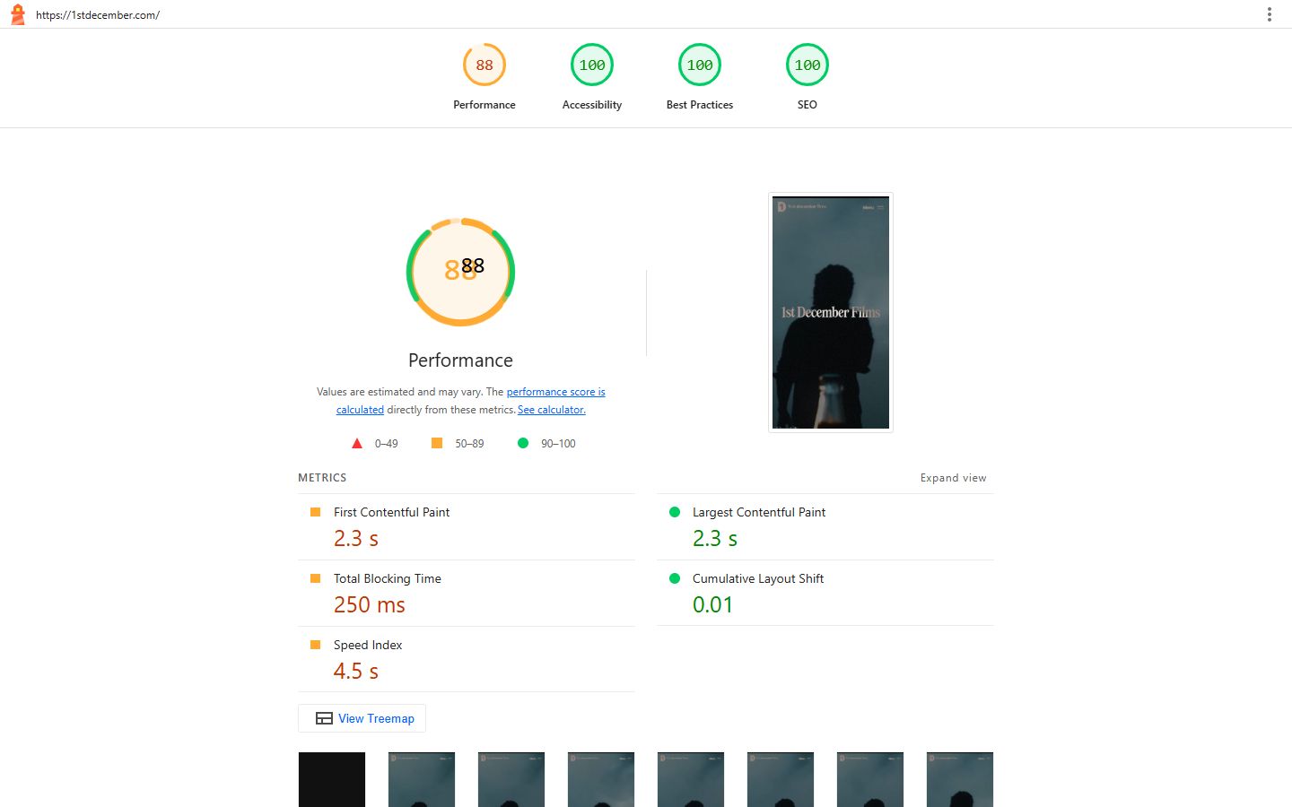
The median mobile home page now weighs 2.6 MB, up 8.4% in a year: 911 KB of images, 632 KB of JavaScript and 122 KB of fonts. Our scan found award homepages transfer a median 6.5 MB against 3.9 MB for SaaS homepages. Award judges don't penalise weight, but your buyers on a train do.
Three habits make the biggest difference: size and compress the hero image (or video poster), cap fonts at two files, and let the CMS prerender likely next pages. Speculation Rules, which do that, now appear on 24% of desktop and 35% of mobile pages, mostly through CMS defaults (Web Almanac 2025 chart data).
Lighter pages also use less energy. The W3C's Web Sustainability Guidelines were republished as a Draft Note on 24 September 2026, and the Sustainable Web Design model estimates emissions from data transferred, so page weight is the lever you control. We've seen the effect of a lighter rebuild: the Futurense site we rebuilt went from a performance score of 39 to 92, alongside a 27% rise in conversion rate, and GoFIGR's went from 52 to 88 after its move from Bubble to Webflow.
19. Built for every market: mobile-heavy, multilingual, multi-script
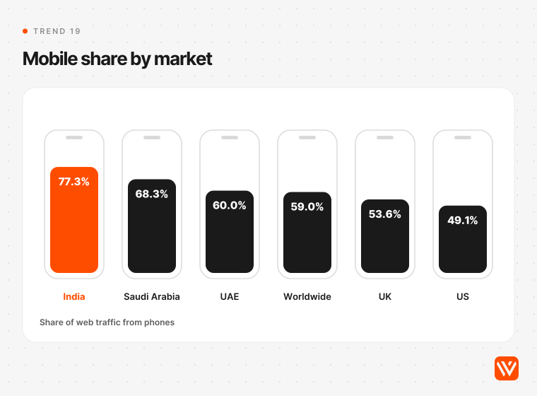
Verdict: adopt if you sell outside one country. Device mix differs more than most design reviews assume. StatCounter's September 2026 data puts mobile's share of web traffic at 77.3% in India, 68.3% in Saudi Arabia, 60.0% in the UAE and 59.0% worldwide, against 53.6% in the UK and 49.1% in the US. A layout signed off on a desktop in San Francisco is the minority view for most of the world.
Design for that:
- Review every page on a mid-range phone first.
- Set the lang attribute correctly (4% of SaaS and 9% of award homepages in our scan didn't).
- Choose fonts that cover the scripts you'll need.
- Use CSS logical properties so a right-to-left Arabic version doesn't need a rebuild.
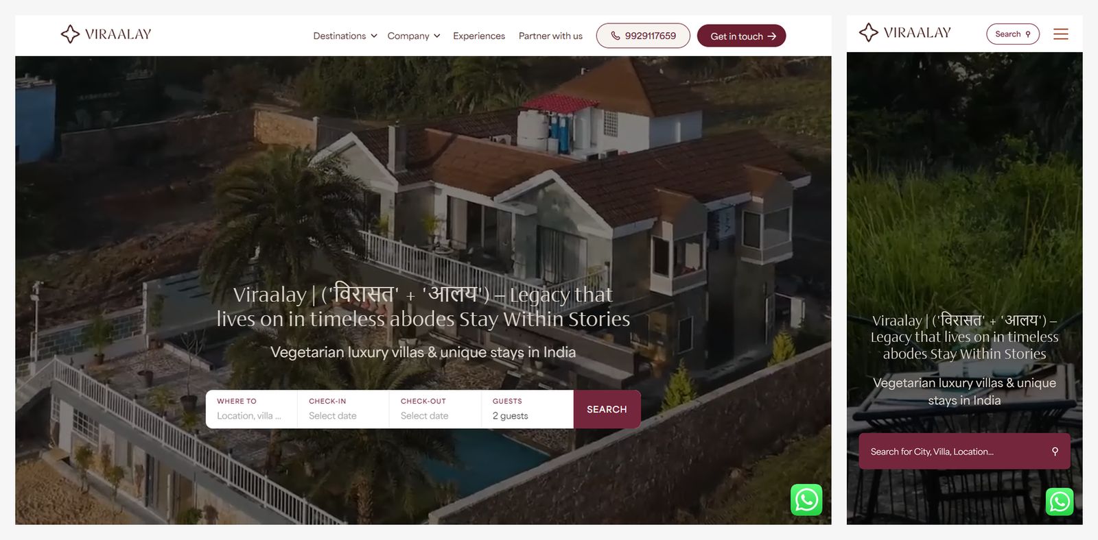
Multi-script type can be a design asset. On Viraalay, a villa brand we built, the hero sets the Devanagari roots of the name, विरासत and आलय, beside the Latin wordmark.
Web design trends that are fading in 2027
These are on their way out, judging by the adoption data and the people who build sites every day.
- Scroll-jacking and full-page scroll plugins. fullPage.js lost 21% of its share of sites in two years, ScrollMagic 21.6% (HTTP Archive). Native scroll with gentle easing replaced them.
- jQuery carousels. OWL Carousel fell 23% and Slick 12.5%. Swiper took over (19.8% of sites), and plenty of teams dropped the carousel entirely.
- Accessibility overlays. They appear on 2% of desktop sites but 0.2% of the top 1,000 (Web Almanac 2025). They don't make a site compliant.
- Voice navigation and AR on marketing sites. Both were 2026 predictions, ours included. We found no data showing either spreading on business websites, and Lindwurm Digital's 2027 outlook calls on-site voice interfaces overvalued.
- The default AI look. Purple gradients, a badge above the headline, three icon cards in a row. It still ships, which is why it no longer impresses.
- llms.txt as a ranking lever. Google's John Mueller compared it to the keywords meta tag. Harmless, not a strategy.
- Retro, Y2K and brutalism as a whole-site look. Common in 2026 trend lists, rare in 2027 ones, and hard to square with a B2B buyer's need for clarity.
Which 2027 trends fit your website?
The right trends depend on what your site has to do. Here's how we'd apply the 19 by type of business.
| Trend | B2B SaaS | Ecommerce | Agency or portfolio | Local service business |
|---|---|---|---|---|
| 1. Built for two readers | Adopt | Adopt | Adopt | Adopt |
| 2. Anti-template look | Adopt | Adopt | Adopt | Test |
| 3. Generative UI | Test in product | Test | Skip | Skip |
| 4. Smooth scroll | Test | Skip | Adopt | Skip |
| 5. View transitions | Adopt | Adopt | Adopt | Adopt |
| 6. Scroll-driven CSS | Test | Test | Adopt | Skip |
| 7. Container queries, :has() | Adopt | Adopt | Adopt | Adopt |
| 8. Native popovers and menus | Adopt | Adopt | Adopt | Adopt |
| 9. Type as hero | Adopt | Test | Adopt | Test |
| 10. Glass | Test | Test | Test | Skip |
| 11. Bento sections | Adopt | Test | Test | Skip |
| 12. Expressive UI | Test | Test | Adopt | Test |
| 13. Warm whites, one accent | Adopt | Adopt | Test | Adopt |
| 14. Dual themes | Adopt | Skip | Test | Skip |
| 15. Purposeful motion | Adopt | Adopt | Adopt | Adopt |
| 16. 3D | Skip | Test (product views) | Test | Skip |
| 17. Accessibility | Adopt | Adopt | Adopt | Adopt |
| 18. Performance and weight | Adopt | Adopt | Adopt | Adopt |
| 19. Every market | Adopt | Adopt | Test | Skip |
Our view: a B2B SaaS team planning a 2027 redesign should spend its budget on trends 1, 9, 13, 17 and 18 first. They're the ones a buyer, a search engine and a regulator will all notice. Add one signature motion or type idea that's unmistakably yours. Leave the WebGL and custom cursors to the award entries.
Where to start with a 2027 redesign
Start with a baseline. Our free AI Design Scorer checks your current site and shows where it stands before you commit to a redesign. If you're comparing build platforms, our Webflow vs Framer comparison covers which one suits which team, and our guide to high-converting B2B SaaS landing pages shows how these trends apply to the pages that sell.
We'll refresh this page as the data moves. Next checks: Pantone's 2027 colour (it usually names one in early December), the Interop 2026 year-end scores, and a repeat of our homepage scan in April 2027.
What are the top web design trends for 2027?
The biggest 2027 web design trends are pages built for AI readers as well as people, an anti-template look that stands apart from AI-made sites, native browser motion (view transitions and scroll-driven CSS), oversized type as the hero, and accessibility driven by legal deadlines in the EU, US, UK and India.
What web design trends are out in 2027?
Scroll-jacking plugins, jQuery carousels, accessibility overlays, voice navigation on marketing sites and the default AI look (purple gradients, badge above the headline, three icon cards) are fading. HTTP Archive data shows fullPage.js down 21% and OWL Carousel down 23% in share of sites over two years.
Is web design still in demand in 2027?
Yes, but the work has shifted. AI builds a first draft in minutes, and Webflow’s CEO Linda Tong noted in September 2026 that the build is about 5% of a site’s total cost of ownership. Demand is moving to what AI does badly: accessibility, performance, AI-search readiness and a look that isn’t generic.
Will AI replace web designers?
Not the good ones. Figma’s Dylan Field said at Config 2026 that AI “has lowered the floor” but “has not raised the ceiling”. AI-made layouts converge on the same patterns, and WebAIM links worsening accessibility to AI-assisted coding. Designers who direct AI tools and add judgement are in a stronger position.
Is glassmorphism back, and are bento grids over?
Both are mainstream now. In our October 2026 scan, 55% of B2B SaaS homepages used glass effects and 25% used bento-style grids. Keep glass to overlays with tested contrast, since measurements on Apple’s Liquid Glass found contrast as low as 1.5:1. Use bento for feature sections, not whole pages.