Summarise this article using AI


The 20 best B2B SaaS websites for 2027 include Hopstack, Ramp, Stripe, Supabase, Vanta, Linear and Attio. What sets them apart is measurable: a headline that names the product, the real interface on the first screen, a self-serve path next to "talk to sales", and published prices. We checked all of it on 64 live homepages in October 2026.
We build Webflow sites for B2B SaaS companies, so we wanted evidence rather than another mood board. On 27 and 28 October 2026 we loaded 64 homepages in headless Chrome, recorded about 30 signals for each, and asked four AI engines which sites they'd recommend. Below: the 20 picks grouped by the buyer they persuade, what to borrow for each buyer type, and when copying them is a mistake.
Key takeaways
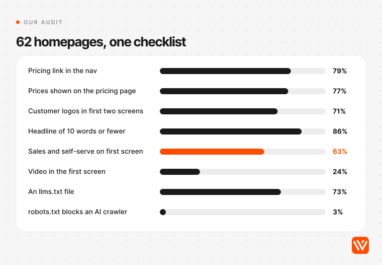
- 39 of the 62 homepages that rendered (63%) put a sales path and a self-serve path on the first screen. Only 12 (19%) offered a demo and nothing else.
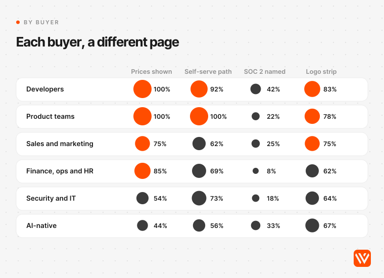
- 48 of 62 (77%) publish prices. Every developer-tool and product-team site in the sample did; only 4 of 9 AI-native products did.
- The median homepage transferred 5.4 MB. Attio's loaded in 1.0 MB and Postman's in 37 MB, on the same machine and connection.
- AI crawlers are mostly let in: just 2 of 63 sites block one in robots.txt and 46 publish an llms.txt file. The weak spot is JavaScript: 9 of 58 homepages served less than 80% of their text in the raw HTML a crawler reads first.
- Only two sites were named by all four AI engines we asked: Linear and Stripe. None of the engines measured anything; they repeated agency listicles.
How we picked these 20 B2B SaaS websites
We picked from a measured audit, not from memory. The pool was 64 B2B SaaS marketing homepages across six buyer types, drawn from the sites AI engines and the current top 10 Google results name most, recognised design leaders, and companies based in India, the UK and Europe so the list isn't US-only. Two of the 64 are sites Webyansh built (Hopstack and GoFIGR). We say so wherever they appear.
Each homepage was loaded at 1,440 by 900 pixels in Chrome from Bengaluru. We recorded the H1, every call to action on the first screen (header included), whether the nav links to pricing and the pricing page shows prices, logos, video and product imagery near the top, transferred bytes after a scroll, the share of the page's words present in the raw HTML (what a non-rendering crawler such as GPTBot reads), robots.txt rules for six AI crawlers, a strict llms.txt check, JSON-LD types, and overflow at a 390-pixel phone width (none of the 62 overflowed). Warp and Whatfix timed out twice, so most figures are out of 62. We didn't log in or accept cookies, so a visitor elsewhere may see a different hero.
A site made the final 20 if the first screen says what the product is (or shows it), it doesn't scroll sideways on a phone, at least 80% of its text is in the raw HTML, and it does one thing better than the other sites aimed at the same buyer. Mercury is the one exception on the third test, explained below. Within those rules the choice is editorial.
What do the best B2B SaaS websites have in common?
The best B2B SaaS websites answer four questions before the visitor scrolls: what is it, who is it for, what does it cost, and can I try it without a call. Most of the 62 homepages we rendered now answer at least three. The differences show up in how they do it.
They name the product in a short headline
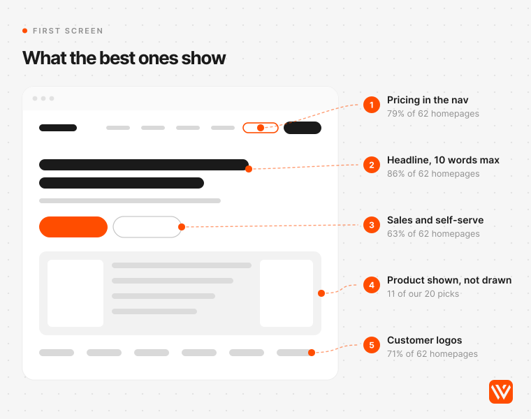
The median H1 across the 62 homepages was 6 words, and 53 of them (86%) used 10 words or fewer. Stripe is the outlier at 23 words, and it gets away with it because the first six do the job. 19 of the 62 headlines (31%) mention AI or agents, which tells you how crowded that word has become.
April Dunford, the positioning consultant, put the shift plainly in May 2026: "Today, customers want answers" (Positioning in the Age of AI). Supabase's two-line "Build in a weekend / Scale to millions" and Granola's "The AI notepad for back-to-back meetings" are answers. "Build for what's next" is a mood.
They show the real product, not a drawing of it
Eleven of our 20 picks put the actual interface on the first screen: Hopstack, Ramp, Deel, Airwallex, PostHog, Datadog, Linear, Notion, Webflow, Granola and Attio. Most of the rest, Stripe, Clay and Mercury among them, spend the first screen on brand and earn the scroll with proof underneath.
Community threads say the same thing with less patience. In an October 2026 r/webdesign thread on why SaaS sites feel generic, the most useful advice was "Real product screenshots. Big ones you can actually read" (Reddit). Raj Nandan Sharma, a Bengaluru-based product engineer, describes the alternative: "Landing pages with different logos and the same skeleton" (Good Taste the Only Real Moat Left, April 2026).
They offer two doors: talk to sales, or start alone
63% of the 62 homepages put both a sales path and a self-serve path on the first screen. That matters because buyers increasingly prefer to start alone: Gartner's March 2026 survey of 646 B2B buyers found 67% prefer a rep-free experience, up from 61% a year earlier (Gartner).

The split by buyer is sharp. Developer tools (75% both, 92% with a self-serve path) and product-team tools (78% both, none sales-only) almost never force a call. Sales-and-marketing software is the most demo-gated group: 3 of 8 offered only a demo or sales contact. Navattic's 2026 scan of about 5,000 B2B SaaS sites found "Book a demo" on 61% and an interactive tour on 18% (Navattic); in our sample only Deel and Arcade embedded a tour on the homepage itself.
Our view: under a few thousand dollars a year in contract value, a demo-only homepage is a tax on your best leads. Above that, keep the demo and add a self-serve route (a sandbox, a tour, a price) for the buying-group members who won't book a call.
They publish prices
48 of the 62 homepages led to a pricing page with real numbers on it. Every developer and product-team tool did. Among AI-native products only 4 of 9 did, and in security and IT only 6 of 11. TrustRadius has found transparent pricing to be buyers' top request of vendors four years running (TrustRadius 2026 B2B Buying Disconnect, July 2026).
Emily Kramer of MKT1, who reviewed 100 high-growth B2B startups in April 2026, makes the AI-era case: buyers will "ask an LLM for your pricing anyway", so the price "might as well be available and accurate on your site" (MKT1). In her sample, sales-led companies showed prices 0% of the time.
They keep the page lighter than you'd expect
The median homepage transferred 5.4 MB after a scroll, with the middle half between 3.2 MB and 6.9 MB. The lightest picks were Attio (1.0 MB), Stripe (1.9 MB), Supabase and Granola (2.1 MB each). Clay's 3D illustration costs it 23.7 MB.
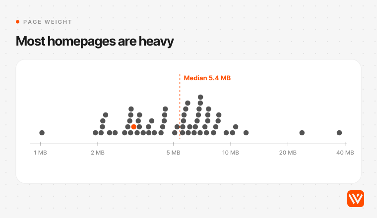
Weight isn't speed, but it's a fair proxy for risk. HTTP Archive's 2025 Web Almanac found only 45% of mobile home pages pass Core Web Vitals, against 56% of inner pages (Web Almanac 2025). The homepage is where the heaviest hero video and the most third-party scripts land, and it's the page your buyer opens first.
Which B2B SaaS website should you copy? What to borrow, by buyer type
Copy the sites built for your buyer, not the ones that win design awards. A finance team, a developer and a security lead check different things first, and the audit shows the best sites in each group behave differently.
| Buyer type | Study these | What the group does (audit) | What to borrow |
|---|---|---|---|
| Operations, finance and HR (13 sites) | Hopstack, Ramp, Mercury, Deel, Airwallex, Razorpay | 85% publish prices; 62% offer both paths; median 5.7 MB | A live number or a real workflow in the hero; a work-email field that starts the trial in one step |
| Developers (12) | Stripe, Supabase, PostHog, Resend | 100% publish prices; 92% have a self-serve path; median 3.2 MB, the lightest group | Docs and pricing one click from the hero; "start" before "talk to us"; a free tier stated on the first screen |
| Security and IT (11) | Vanta, Datadog, incident.io | Only 55% publish prices; 27% sales-only | Name the frameworks you cover in the subhead; put a free trial next to the demo for the engineer who'll evaluate you |
| Product and design teams (9) | Linear, Notion, Webflow | 100% publish prices; none sales-only | Let the product be the hero image; show which companies use it, then get out of the way |
| AI-native products (9) | Intercom, Granola | 44% publish prices; none self-serve only | Say what the AI does in plain words, with a human option beside it |
| Sales and marketing (8) | Attio, Clay | 38% sales-only, the most demo-gated group | A distinctive visual identity in a category where every site looks alike; a free start next to the demo |
The 20 best B2B SaaS websites for 2027
These are grouped by buyer, not ranked. The groups run in order of how many of the 62 audited sites serve that buyer, starting with operations and finance software (13 sites). Within the first group we start with the one site on this list we built, so you can judge our eye before you use our picks.
| # | Website | Buyer | Built on | First screen | Prices public | Page weight |
|---|---|---|---|---|---|---|
| 1 | Hopstack | Operations | Webflow | Demo | No | 3.1 MB |
| 2 | Ramp | Finance | Next.js | Demo and free start | Yes | 10.6 MB |
| 3 | Mercury | Finance | Next.js | Open account and demo | Yes | 10.2 MB |
| 4 | Deel | HR | Next.js | Demo | Yes | 3.7 MB |
| 5 | Airwallex | Finance | Next.js | Demo and get started | Yes | 6.8 MB |
| 6 | Razorpay | Finance (India) | Framer | Sign up | Yes | 5.6 MB |
| 7 | Stripe | Developers | Next.js | Sales and invite | Yes | 1.9 MB |
| 8 | Supabase | Developers | Next.js | Start and demo | Yes | 2.1 MB |
| 9 | PostHog | Developers | Gatsby | Free start and human | Yes | 6.9 MB |
| 10 | Resend | Developers | Next.js | Get started | Yes | 6.5 MB |
| 11 | Vanta | Security | Webflow | Demo | No | 5.8 MB |
| 12 | Datadog | IT and security | Not detected | Free trial | Yes | 7.6 MB |
| 13 | incident.io | IT | HubSpot CMS | Demo and free start | Yes | 2.3 MB |
| 14 | Linear | Product teams | Next.js | Sign up and contact | Yes | 2.9 MB |
| 15 | Notion | Product teams | Next.js | Free and demo | Yes | 5.6 MB |
| 16 | Webflow | Marketing teams | Webflow | Start free and sales | Yes | 8.7 MB |
| 17 | Intercom | Support (AI) | Next.js | Trial, demo and sales | Yes | 5.2 MB |
| 18 | Granola | Teams (AI) | Next.js | Download and sales | Yes | 2.1 MB |
| 19 | Attio | Sales (UK) | Next.js | Free start and sales | Yes | 1.0 MB |
| 20 | Clay | Sales and marketing | Webflow | Trial and demo | Yes | 23.7 MB |
Clay's pricing page timed out in the automated check, so we confirmed its public prices by hand. "Not detected" means our fingerprint didn't match a known platform.
Best B2B SaaS websites for operations and finance buyers
Finance and operations buyers want to see money or goods move. The best sites in this group put a number, a card or a ledger on the first screen and make the first step a work-email field rather than an eight-field form.
1. Hopstack: warehouse software that shows the warehouse
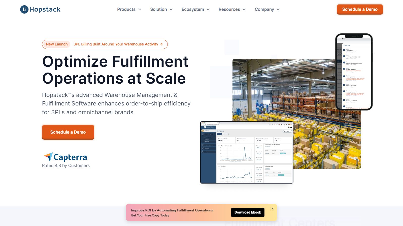
Disclosure first: Webyansh rebuilt hopstack.io on Webflow in 2024, so this is our work under the same audit as everyone else's. The hero pairs a direct headline ("Optimize Fulfillment Operations at Scale") with the product on three screens, a photo of a real fulfilment floor, and a Capterra rating where the eye lands after the button.
Our brief was a minimal design with no heavy animation, an LCP target under 2.5 seconds, and no ranking loss while every resource moved over. The Hopstack case study records 266.4% more organic traffic afterwards and domain authority up from 24 to 37 in six months. The homepage now weighs 3.1 MB and carries SoftwareApplication schema and an llms.txt file.
Where it falls short of this list's best: one door (Schedule a Demo) and no public prices. For a platform sold on implementation that's defensible, and it's still the first thing we'd test.
2. Ramp: a live number in the hero
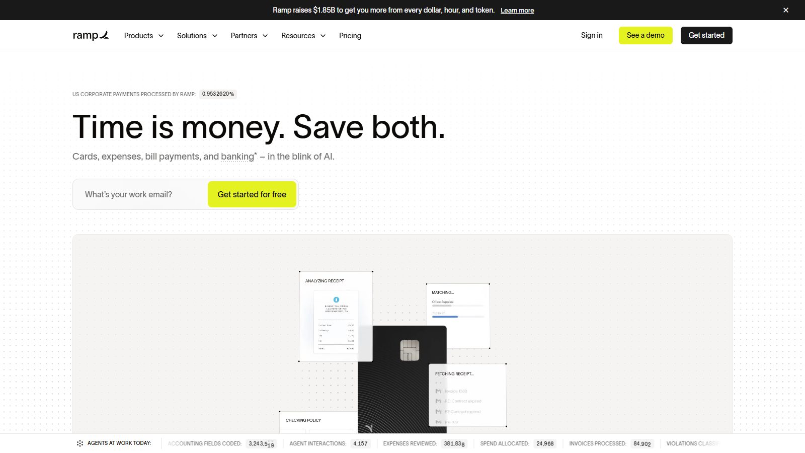
"Time is money. Save both." is five words, and the screen underneath does the persuading: a running counter of the share of US corporate payments Ramp processes, product cards for receipts and approvals, and a strip of totals for its AI agents' work that day. One email field starts a free account; "See a demo" waits in the nav. The cost is weight: 10.6 MB, much of it video.
Borrow: one figure that only your product can show, updating in front of the visitor.
3. Mercury: brand first, demo second
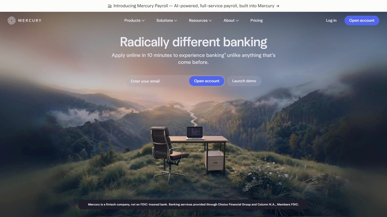
Mercury breaks the product-first rule on purpose. "Radically different banking" sits over a calm landscape photo, the regulatory line ("Mercury is a fintech company, not an FDIC-insured bank") is visible on the first screen, and the two buttons are "Open account" and "Launch demo", an interactive tour rather than a sales call. It's the one pick that misses our raw-HTML test (71% of its text is in the HTML a non-rendering crawler reads). We kept it because no other finance site handles brand and compliance this cleanly; fix that part before you copy it.
Borrow: put the compliance sentence your category requires where the buyer can see it, not in a footer.
4. Deel: let the visitor pick their job
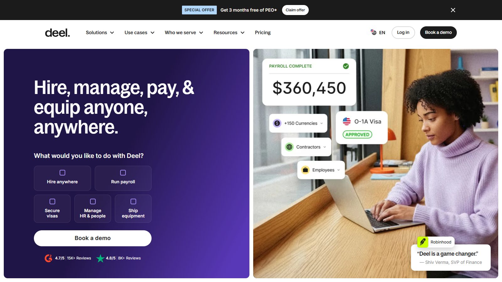
Deel's hero asks "What would you like to do with Deel?" and offers five tiles: Hire anywhere, Run payroll, Secure visas, Manage HR and people, Ship equipment. That one question routes five kinds of buyer to five different stories without a nav click. It was also one of only two homepages in our sample with an embedded interactive demo (Navattic).
Borrow: a "what are you here to do" selector if your product serves more than one department.
5. Airwallex: a product tour above the email field
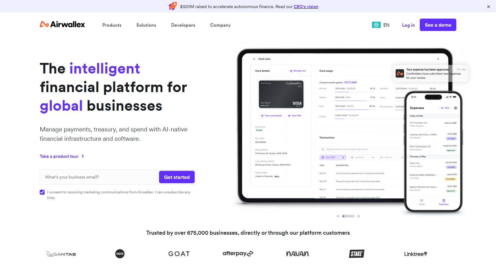
Airwallex shows card controls and an expense feed in Australian dollars, puts "Take a product tour" above the email field, and backs it with "Trusted by over 675,000 businesses" and a logo row (Qantas, Xero, GOAT, Afterpay, Navan). The tour link gives a cautious finance buyer something to do that isn't a sales call. One quirk: there's no pricing link in the main nav, although its pricing page does publish prices.
Borrow: local currency in your product screenshots when you sell in that market.
6. Razorpay: Indian payments, built on Framer

The Bengaluru company's homepage is a carousel of offers aimed at Indian businesses, with a strip of household-name Indian customers (Zomato, Swiggy, Zerodha and Nykaa among them) and a product picker under the hero. It's built on Framer, carries FAQPage schema on the homepage, and its sign-up path skips the demo entirely, which suits a payment gateway that merchants switch on themselves.
Borrow: logos your buyer's own customers would recognise. For an Indian SMB that's Zomato, not a Fortune 500 name.
Best B2B SaaS websites for developer buyers
Developer tools are the most self-serve group in the audit: 11 of 12 had a self-serve path on the first screen and all 12 published prices. They're also the lightest, with a median of 3.2 MB.
7. Stripe: the reference everyone still checks
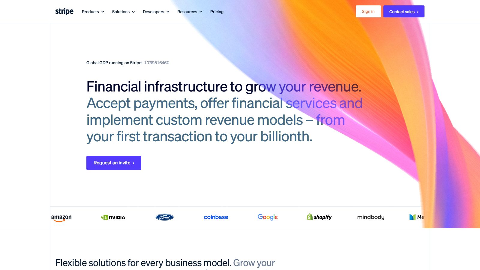
Stripe opens with a live counter of global GDP running on Stripe, a long headline that front-loads "Financial infrastructure to grow your revenue", and a logo row (Amazon, NVIDIA, Ford, Coinbase, Google, Shopify). At 1.9 MB it's the second-lightest homepage of the 62, gradient and all. It was one of only two sites all four AI engines named. Daryl Ginn, who runs the Godly gallery, wrote in 2023 that "It wasn't long ago that everyone looked to Stripe for inspiration" (The Linear effect). It's still the default example.
Borrow: restraint with weight. The hero looks expensive and costs little.
8. Supabase: two lines, two buttons, a product map
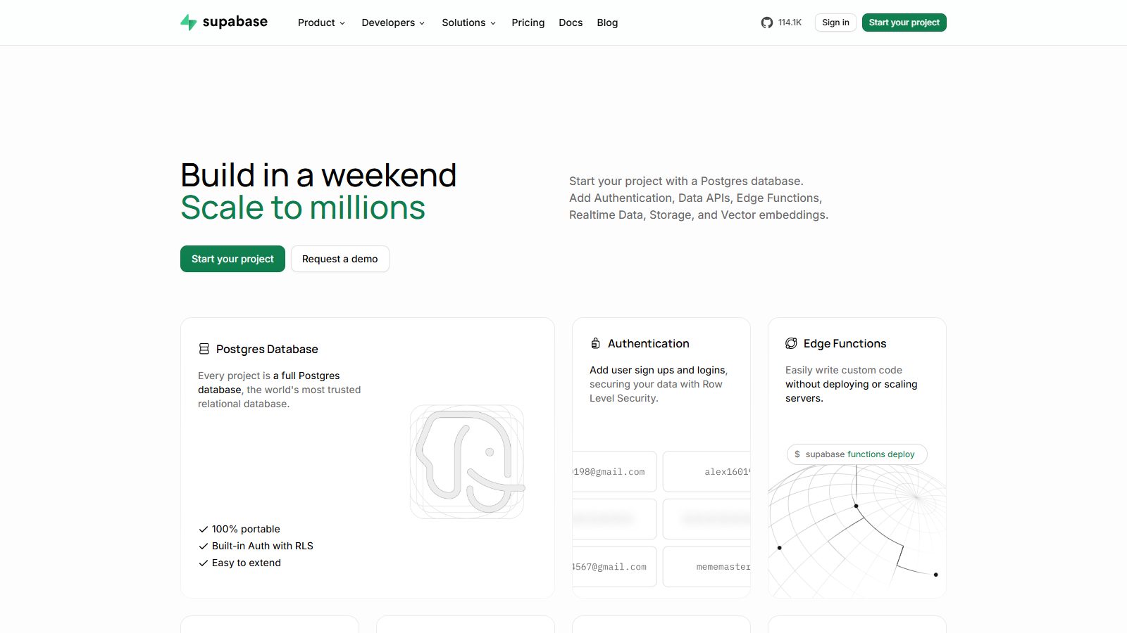
"Build in a weekend / Scale to millions", then "Start your project" and "Request a demo" side by side, and a grid of the product's parts (Postgres database, authentication, edge functions and more) where a hero image would usually go. Its pricing page showed more price figures than any other in our audit. The homepage weighs 2.1 MB and ships nine schema types, including SoftwareApplication and an OfferCatalog.
Borrow: show your product's components when your buyer is assembling a stack.
9. PostHog: a personality nobody else would ship
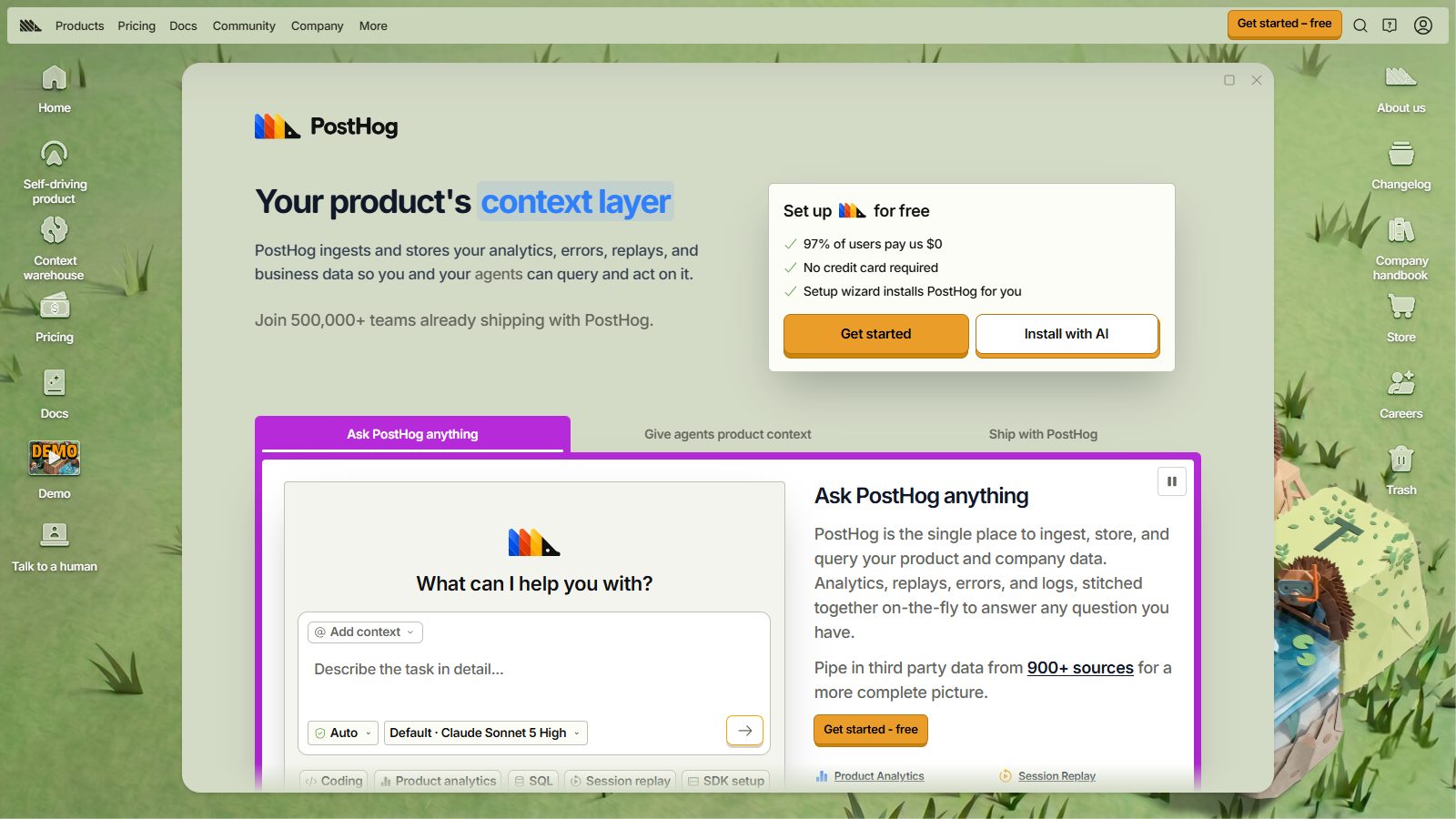
PostHog's homepage is a desktop: windows, file icons, a meadow wallpaper. Under the joke is a serious pricing pitch on the first screen ("97% of users pay us $0", "No credit card required") and a nav link labelled "Talk to a human". It's heavier (6.9 MB) and it won't suit an enterprise security buyer, which is the point. Linear's co-founder Karri Saarinen argued in May 2025 that "Quality creates gravity" (Linear); PostHog applies the idea to tone.
Borrow: state the free tier as a fact, with a number, where the buyer decides whether to keep reading.
10. Resend: the dark, serif developer brand
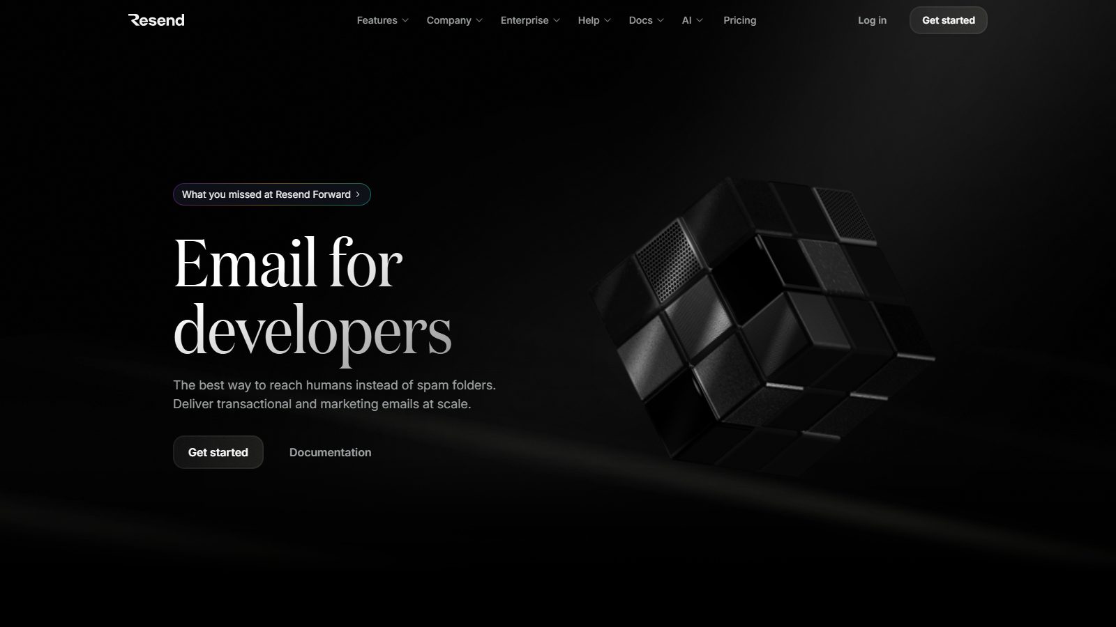
"Email for developers" in a serif face on black, a 3D cube, and two buttons: "Get started" and "Documentation". It's the one dark hero on our list that doesn't read as a Linear copy, mostly because of the type. Pricing is public, and there's no demo button at all.
Borrow: a typeface decision. It's the cheapest way to stop looking like everyone else.
Best B2B SaaS websites for security and IT buyers
Security and IT software is where pricing goes quiet: only 6 of 11 sites in this group publish prices. The best ones make up for it with specifics.
11. Vanta: the frameworks in the subhead
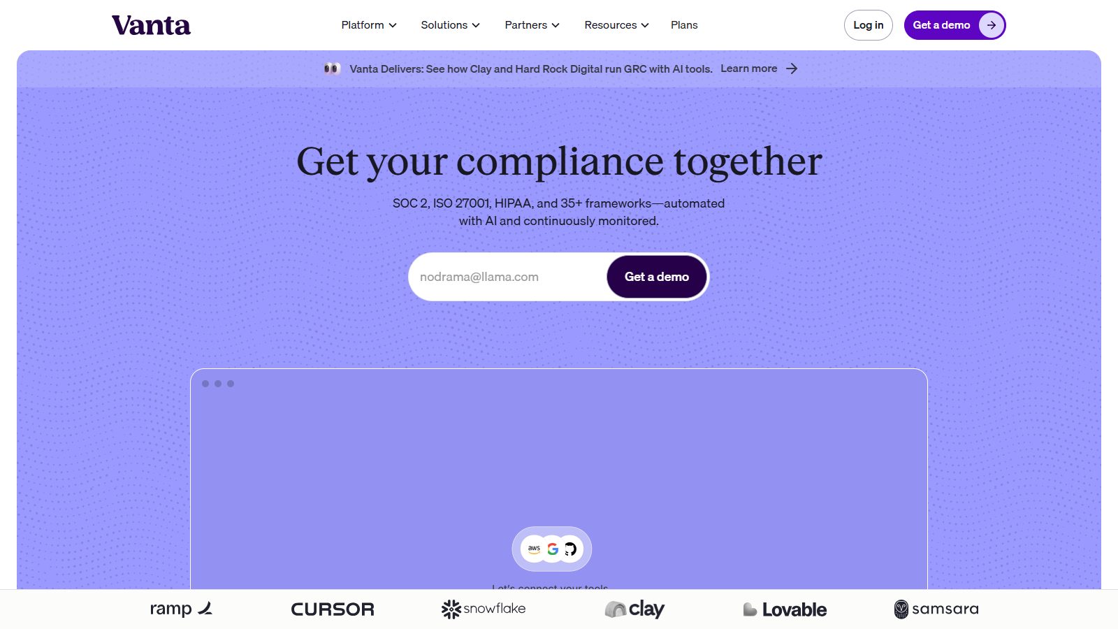
"Get your compliance together" is plain English, and the subhead does the specialist's work: SOC 2, ISO 27001, HIPAA and 35+ frameworks, automated and continuously monitored. A work-email field leads to "Get a demo", and the logo row (Ramp, Cursor, Snowflake, Clay, Lovable, Samsara) is the buyer's peer group. It's built on Webflow. No public prices and no llms.txt, both of which we'd fix.
Borrow: name the standards your buyer is audited against in the first two lines.
12. Datadog: the dashboard is the hero
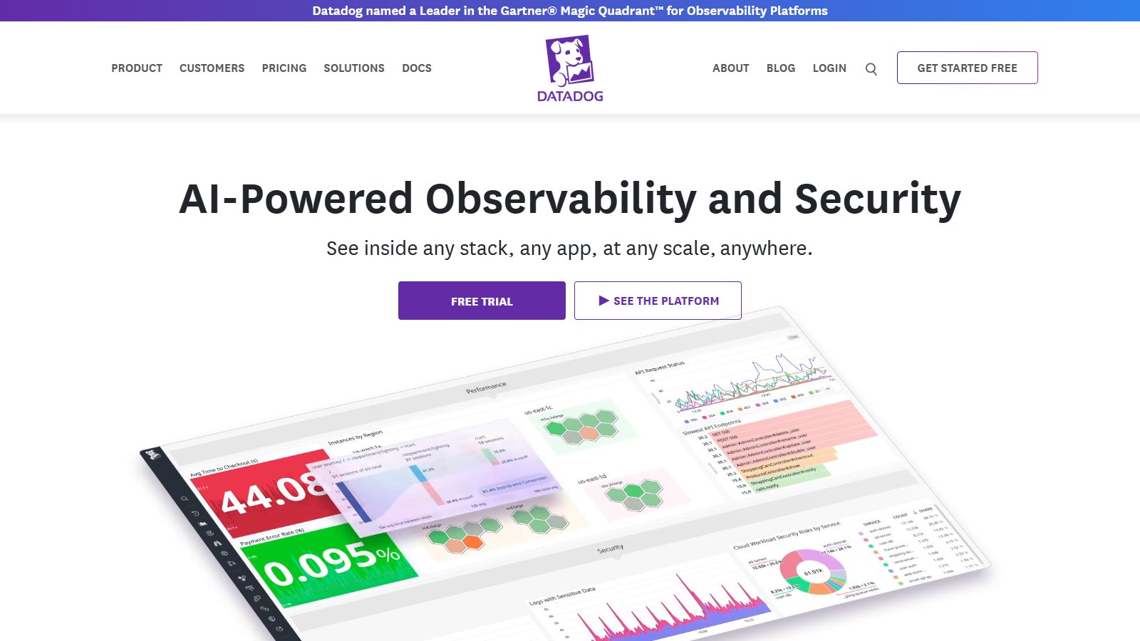
"AI-Powered Observability and Security", a free-trial button, "See the platform", and a full dashboard tilted into the frame. A Gartner Magic Quadrant banner sits above the nav. Prices are public on its pricing page. It's 7.6 MB, but it's selling to engineers who expect to see the product before anything else.
Borrow: lead with the screen your user will stare at every day.
13. incident.io: serif calm for a stressful category
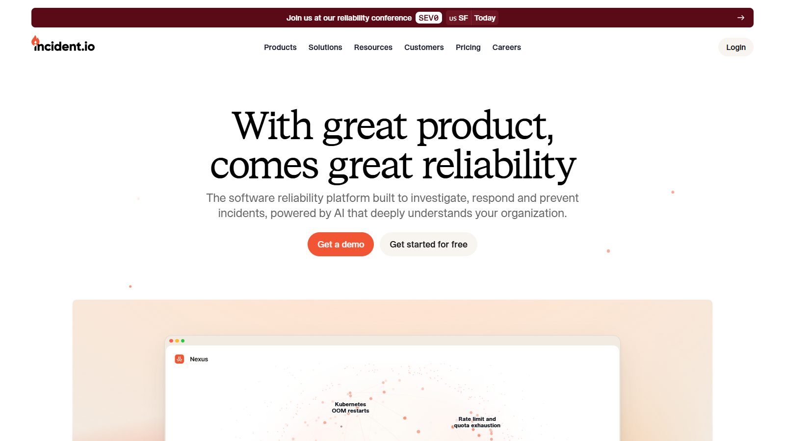
incident.io, which has teams in London, New York and San Francisco, sells incident response, and its homepage is the calmest on this list: a serif headline ("With great product, comes great reliability"), one line of explanation, and "Get a demo" next to "Get started for free". It's built on HubSpot CMS and weighs 2.3 MB. Perplexity named it among its recommendations.
Borrow: match the emotional register to the buyer's worst day. Calm sells to people who get paged at 3 a.m.
Best B2B SaaS websites for product and design teams
Product-team tools behave like consumer apps: all 9 in the audit had a self-serve path on the first screen, none were sales-only, and all published prices.
14. Linear: the site that started a look
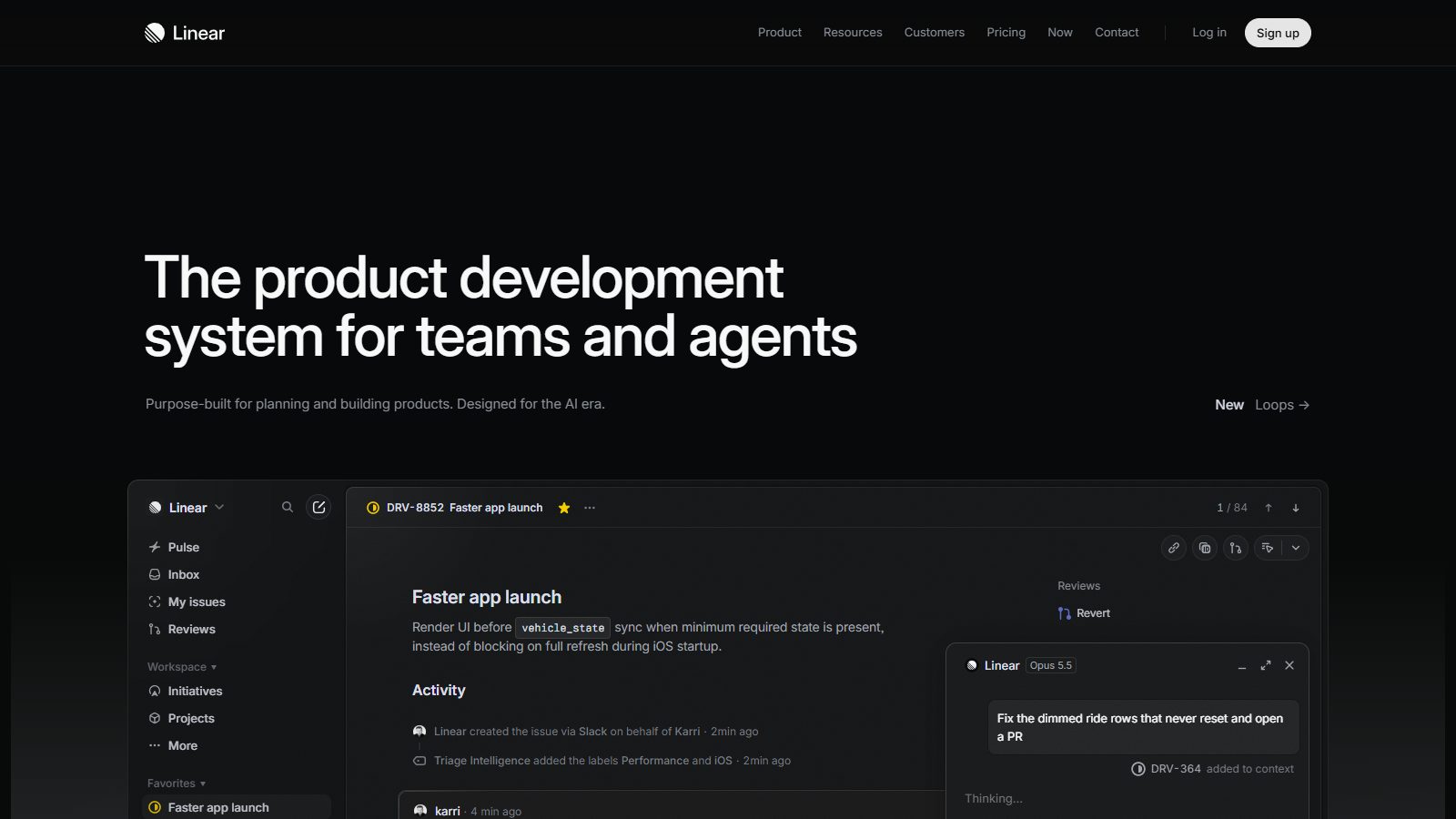
"The product development system for teams and agents", dark, with the real issue tracker filling the lower half of the screen. Linear is the site Reddit and Hacker News threads name most, both as the one to copy and as the one everyone already copied. Daniel Schwarz wrote in LogRocket in June 2025 that "people are starting to note that almost every SaaS website looks the same" (LogRocket). At 2.9 MB it's light. It has no JSON-LD at all, an easy fix it hasn't made.
Borrow: the product screenshot at full size. Skip the dark gradient unless your brand already owns it.
15. Notion: a rotating word and a real page
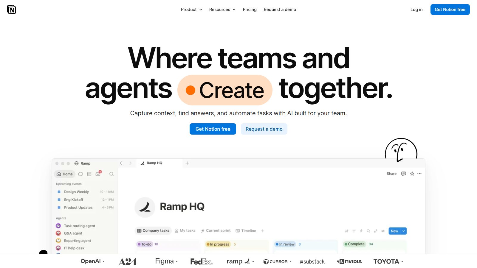
"Where teams and agents [Create] together", with the verb rotating, then two buttons ("Get Notion free", "Request a demo") and a real workspace page below, branded for one of its customers. The logo row (OpenAI, A24, Figma, FedEx, Ramp, Toyota) runs straight under the fold. Three of the four AI engines named Notion.
Borrow: show the product filled with a believable customer's content, not filler text.
16. Webflow: outcomes on the cards
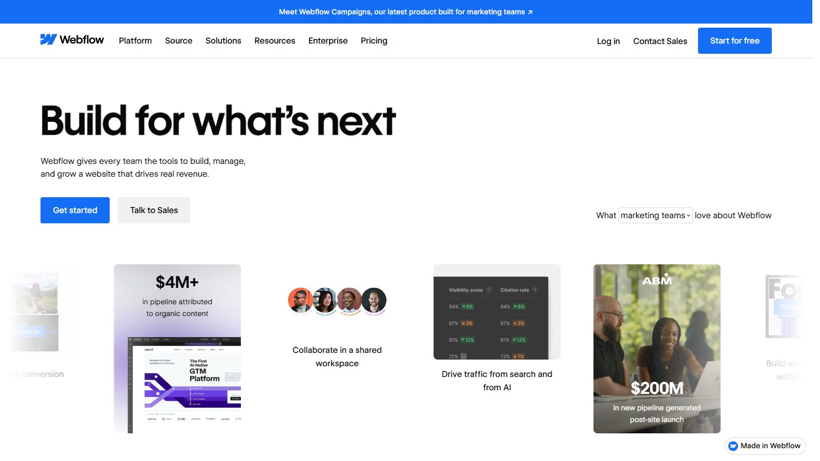
Webflow's headline ("Build for what's next") is the vaguest on this list. The cards under it carry the argument instead: "$4M+ in pipeline attributed to organic content", "$200M in new pipeline generated post-site launch". Its 19 schema types were the second-richest set in the audit after Chargebee's. We're a Webflow agency, so weigh the bias; we included it because three engines named it and its card pattern works.
Borrow: put a customer's result on each feature card instead of a feature name.
Best B2B SaaS websites for AI-native products
AI-native products are where the audit found the least transparency: 4 of 9 published prices, and none relied on self-serve alone.
17. Intercom: editorial type and a human promise
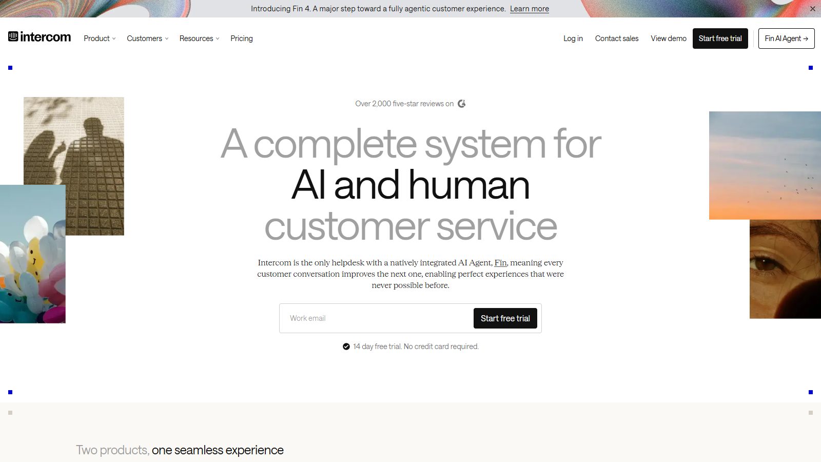
"A complete system for AI and human customer service" sets the scope in one line: AI and people, not AI instead of people. The serif headline and photo collage read like a magazine, a G2 review line sits above, and the main button starts a 14-day free trial with no credit card, with "View demo" and "Contact sales" in the nav. Every door is open.
Borrow: say what the AI does and where a human steps in. Buyers are tired of being told the agent does everything.
18. Granola: a product window and a promise about bots
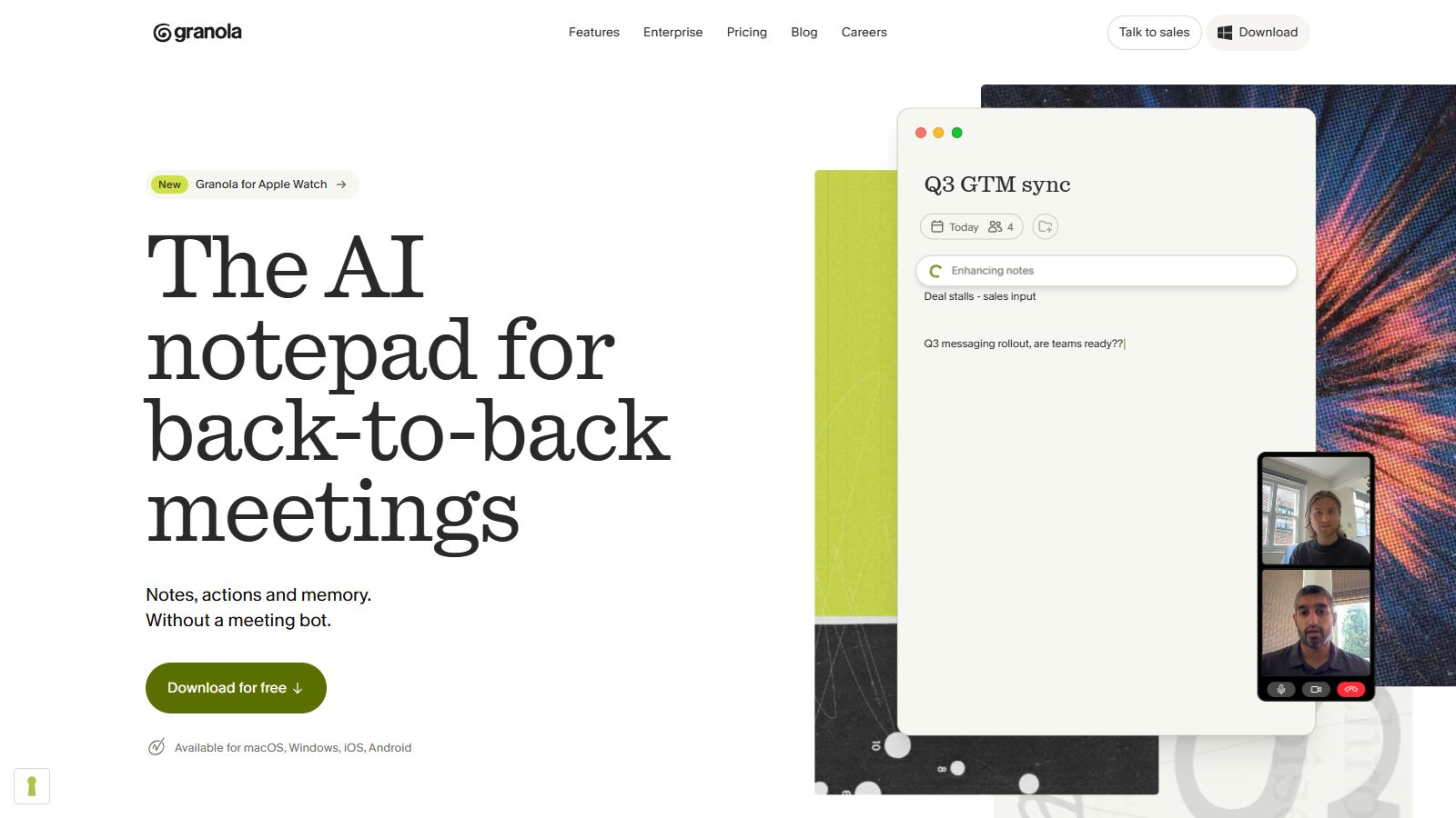
"The AI notepad for back-to-back meetings", then "Notes, actions and memory. Without a meeting bot." That last sentence answers the objection every buyer of meeting software has before they ask it. A real notes window and two video tiles fill the right side, and "Download for free" is the only big button. The page weighs 2.1 MB.
Borrow: answer the category's main objection in the subhead.
Best B2B SaaS websites for sales and marketing buyers
Sales-and-marketing software is the most demo-gated group in the audit (3 of 8 sites offered only a demo or sales contact) and the most visually crowded category. The two below escape both problems.
19. Attio: the lightest homepage we measured
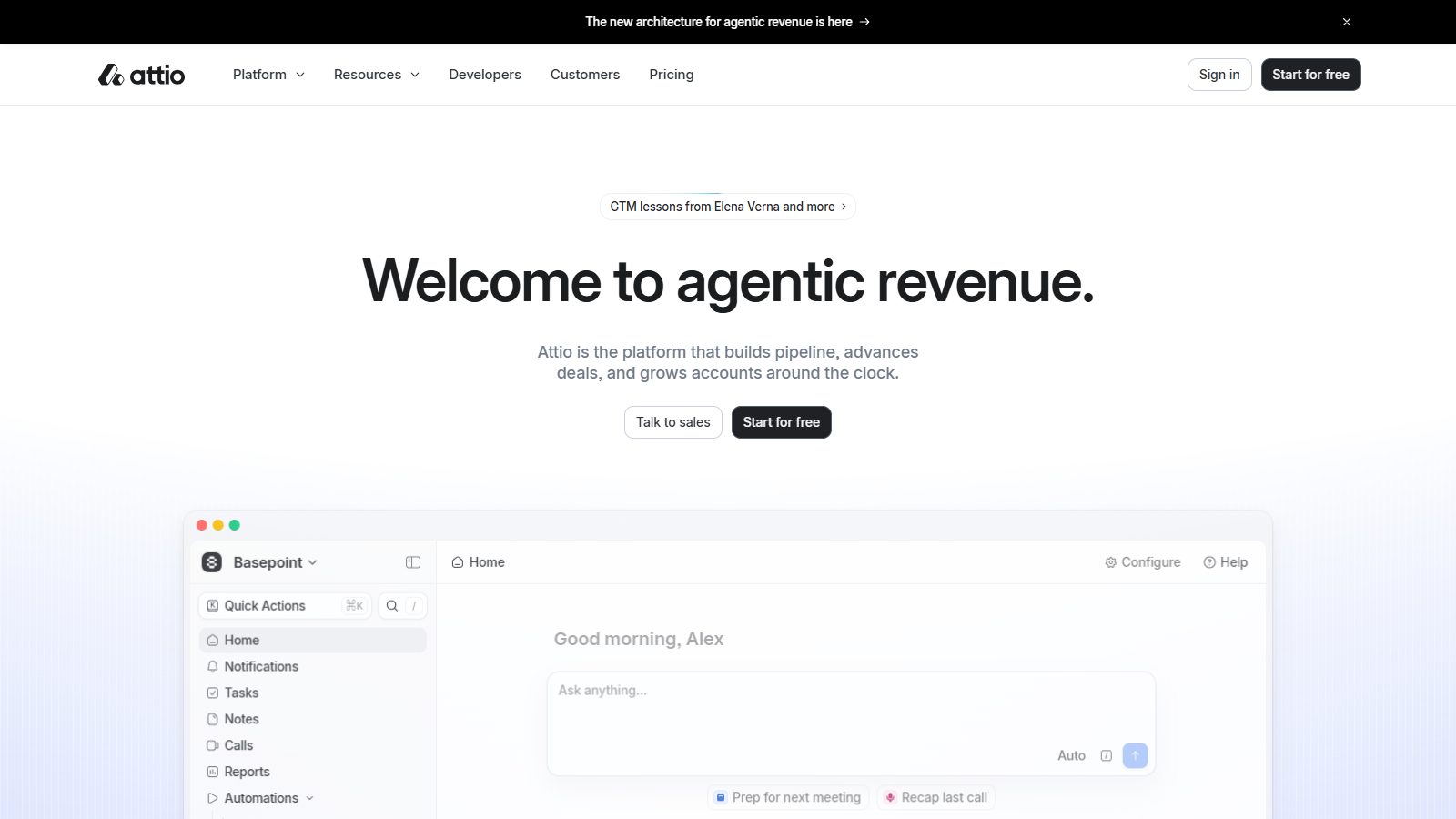
Attio's homepage transferred 1.0 MB, the least of all 62. The London CRM opens with "Welcome to agentic revenue.", a line saying the platform builds pipeline, advances deals and grows accounts, and a working CRM view below, with "Talk to sales" and "Start for free" side by side. Kate Donnellan, Attio's campaigns lead, wrote in August 2026 that its brand copy and visual went through "more than 250 iterations before the words held up on their own" (Attio). Its robots.txt blocks one AI crawler, Common Crawl's CCBot, and lets GPTBot and ClaudeBot in.
Borrow: the weight budget. You can look this good at 1 MB.
20. Clay: an illustration nobody can copy

Clay sells data enrichment, about the least visual product imaginable, and fronts it with a hand-built 3D machine of funnels, seesaws and mailboxes. "Build systems to grow revenue" sits over it with a free trial and a demo. It's built on Webflow, every word is in the raw HTML, and it's the second-heaviest homepage we measured at 23.7 MB. Peep Laja of Wynter wrote in 2023 that "Almost all B2B SaaS brands are playing it safe" (LinkedIn); Clay is the counter-example.
Borrow: an owned visual world, if you have the budget to keep it light. Clay hasn't managed the second part.
What changed for B2B SaaS websites between 2024 and 2026?
Buyers now do most of the work before they meet you, and more of that work happens inside AI assistants. The website's job moved from creating interest to confirming a decision.
Where it came from. Around 2023 the "Linear look" (dark backgrounds, glowing gradients, a big product screenshot) replaced Stripe's gradients as the template every startup copied. Daryl Ginn's January 2023 newsletter even recorded Linear co-founder Jori Lallo asking whether Linear should go from dark to light mode.
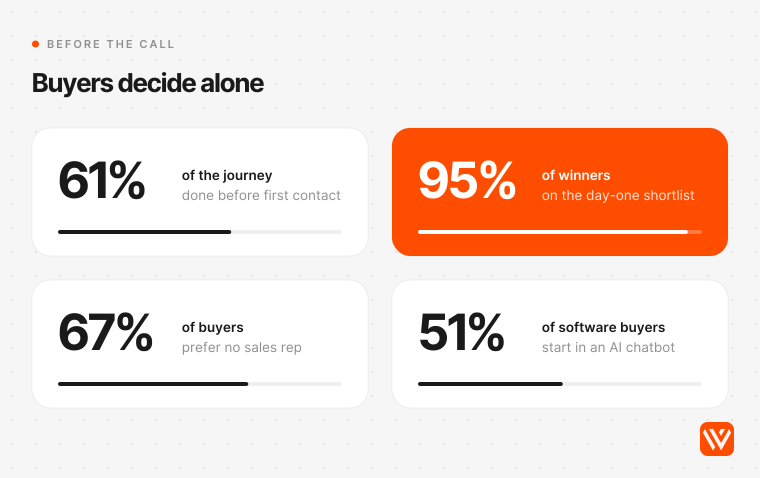
Where it is now. 6sense's November 2025 study of about 4,000 buyers found they first contact a vendor 61% of the way through the journey, and the winner is on the day-one shortlist 95% of the time (6sense). It also found 62% of buyers needed a seller to answer AI questions (training data, security, cost) that were "rarely clear on vendor websites". G2's April 2026 survey of 1,076 software buyers found 51% now start research in an AI chatbot more often than in Google, up from 29% a year earlier (G2). Dave Gerhardt of Exit Five, relaying Iron Horse CEO Uzair Dada's estimates, wrote in May 2026 that the website "has become more of a selection layer than an awareness layer" (Exit Five).
Where it's going (our forecast). Cloudflare saw AI "user action" crawling, where an assistant fetches a page live for a person, grow more than 15 times during 2025 (Cloudflare Radar 2025). We expect pricing, security and docs pages to be fetched most, so by 2027 they'll need the design care the homepage gets today. That's a forecast, not a measured trend.
How do AI search engines see these websites?
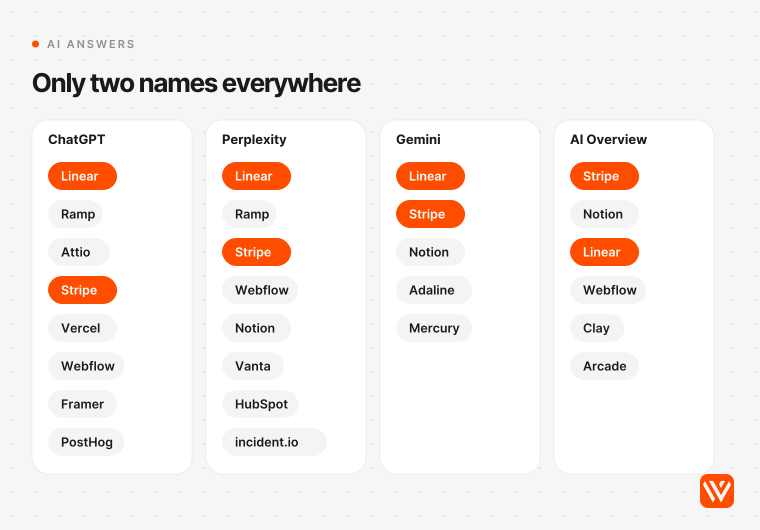
AI engines recommend the same few sites and cite agency listicles to do it. On 27 October 2026 we asked ChatGPT, Perplexity, Gemini and Google's AI Overview for the best B2B SaaS websites for design inspiration. Linear and Stripe appeared in all four answers; Notion and Webflow in three. The 26 sources the four answers cited were agency and publisher blogs, galleries and YouTube videos. None had measured a single site.
That's a warning and an opening. The engines can only repeat what's published, and almost nothing published is measured. Seer Interactive's data across 53 brands shows that being cited inside an AI Overview brings about 120% more organic clicks per impression than not being cited, and comparison searches triggered an AI Overview 95.4% of the time in its sample (Seer Interactive, April 2026).

The audit's crawler results:
- robots.txt: 61 of 63 sites let every AI crawler we tested reach the homepage. Attio blocks only CCBot. Figma blocks the training crawlers (GPTBot, ClaudeBot, CCBot, Google-Extended) site-wide while letting the search crawlers (OAI-SearchBot, PerplexityBot, Claude-SearchBot) reach an allowlist of pages, a split we expect more companies to copy.
- llms.txt: 46 of 63 publish one that passes a strict check (a Markdown heading on line one, served as text). Mercury's now returns "no longer available".
- Raw HTML: the median homepage had 98% of its rendered words in the raw HTML, but 9 of 58 had less than 80%: Clerk, Cloudflare, Cursor, Darwinbox, Mercury, Railway, Snowflake, Wiz and Zoho.
- Schema: 49 of 62 homepages carry Organization markup; only 5 carry FAQPage.
Webflow's July 2026 study of 2,000 company sites found the median company appears in 16% of answer-engine responses and gets a linked citation in 6% (Webflow AEO Maturity Index). Rand Fishkin of SparkToro put the practical point well in June 2026: "Don't neglect your website in all this" (SparkToro).
Where do India, the UK and the US differ?
Buying behaviour differs more than website design does. UK and Ireland buyers control 57% of their journey before any vendor contact, against 61% globally, according to the UK and Ireland edition of the 6sense study (MarketOne, November 2025). 6sense also found buying cycles in Asia-Pacific shortened the most, from 13 months to 10.9. On search, Ofcom found about 30% of UK searches now show an AI Overview (Ofcom), and Google says AI Overviews are lifting usage by more than 10% for the queries where they appear in both the US and India (Google India).
Our audit included 11 companies whose own sites name a home base in India, the UK or Europe:
| Company | Home base (as its site states) | Both paths on first screen | Prices public | Page weight |
|---|---|---|---|---|
| Razorpay | Bengaluru | No (sign-up only) | Yes | 5.6 MB |
| Zoho | India | No (sign-up only) | No | 3.7 MB |
| BrowserStack | India | Yes | Yes | 2.1 MB |
| Postman | Bangalore and San Francisco | Yes | Yes | 37.3 MB |
| Attio | London | Yes | Yes | 1.0 MB |
| incident.io | London, New York, San Francisco | Yes | Yes | 2.3 MB |
| GoCardless | London | Yes | Yes | 2.8 MB |
| Synthesia | London | Yes | Yes | 3.5 MB |
| Granola | London and San Francisco | Yes | Yes | 2.1 MB |
| Framer | Amsterdam | No (self-serve only) | Yes | 9.5 MB |
| Pitch | Berlin | No (self-serve only) | Yes | 3.3 MB |
Ten of the 11 publish prices and their median weight is 3.3 MB, against 5.4 MB for all 62. All five London companies offer both paths, while Razorpay and Zoho skip the demo button entirely. Eleven sites is a small sample, so treat this as directional. If you sell into India from a US-style site, the gaps worth closing are customer logos your buyer recognises and prices in rupees, not a different design language.
When should you not copy these websites?
Some of these patterns will hurt you. Skip them in these cases:
- You don't have a product worth screenshotting yet. A pre-launch or early-beta product looks thinner in a full-width screenshot than in a clear diagram. Use the diagram until the product earns the space.
- Your buyer is procurement, not the user. Ramp's counters and PostHog's desktop work because users choose those tools. If a committee at a bank signs, lead with Vanta-style specifics: frameworks, certifications, a named peer group.
- Your contract needs a scoping call. Hopstack, Vanta and Gong keep prices off the page for a reason. Publish a starting price or a range if you can; if you genuinely can't, say what drives the price so the buyer can estimate it.
- Your homepage is already over 10 MB. Don't add a 3D hero or autoplay video until the page is under the 5.4 MB median. Clay's illustration is great; its 23.7 MB isn't something to copy.
- You'd be the tenth dark, gradient SaaS site in your category. In a crowded category, the Linear look is camouflage.
How do you turn this list into a better website?
Start with your buyer, then measure your own homepage against the same checks.
- Pick three references from your buyer group in the table above, plus one from outside it for contrast.
- Rewrite your H1 so it names the product category or outcome in 10 words or fewer.
- Put the real product on the first screen, at a size people can read.
- Add a self-serve path next to the demo: a free start, a sandbox, an interactive tour or a public price.
- Check what a crawler sees: view the raw HTML and confirm your headline and main copy are there without JavaScript, and that robots.txt doesn't block the AI crawlers you want citing you.
- Weigh the page. If it's above 5.4 MB, cut video and third-party scripts before you add anything.
- Score the result with our free AI Design Scorer, which audits a homepage design for you.
If you're planning a rebuild, our B2B SaaS Webflow practice and the GoFIGR case study (a Bubble to Webflow move that took its performance score from 52 to 88) show how we approach it. For the people side, see our list of the best B2B SaaS web design agencies; for a faster start, the best B2B SaaS Webflow templates; and for budgets, what a Webflow build for B2B SaaS costs. Our scan of web design trends for 2027 covers the motion and layout patterns these sites use.
What makes a B2B SaaS website good in 2027?
A good B2B SaaS website lets a buyer decide without a call. In our audit of 62 homepages the best ones named the product in a short headline, showed the real interface, offered a self-serve path beside the demo and published prices. 63% offered both paths on the first screen and 77% published prices.
Should a B2B SaaS website show pricing?
Yes, in most cases. 77% of the 62 homepages we audited lead to a pricing page with real prices, and every developer and product-team tool did. TrustRadius has found transparent pricing to be buyers’ top request four years running. If your price needs scoping, publish a starting price or explain what drives it.
Is a demo or a free trial better for a B2B SaaS website?
Offer both when you can. 63% of the homepages we audited put a sales or demo path and a self-serve path on the first screen, while 19% offered only a demo. Demo-only pages suit high contract values; below a few thousand dollars a year, a free start or an interactive tour usually serves buyers better.
What platforms do the best B2B SaaS websites use?
Next.js leads by a wide margin. Of the 64 B2B SaaS homepages we audited in October 2026, 32 ran on Next.js, 8 on Webflow, 5 on Framer and 3 on Astro, and 10 matched no known platform. Webflow sites on our list include Hopstack, Vanta, Clay and Webflow itself; Razorpay runs on Framer.
How heavy should a B2B SaaS homepage be?
Aim for under 5 MB. The median homepage in our audit transferred 5.4 MB after a scroll, with the middle half between 3.2 MB and 6.9 MB. Attio loaded in 1.0 MB and Stripe in 1.9 MB, so a polished design doesn’t need a heavy page. Video and third-party scripts are the usual culprits.